

Swolverine
Role
Senior Product Designer, design lead (post-acquisition)
Scope
Full DTC ecommerce redesign, homepage through checkout, 100+ SKUs
Tools
Figma, Claude, Claude Code, Figma MCP, Mouseflow
Timeline
Soon to be in engineering handoff
Swolverine is a DTC supplement brand for athletes, acquired by Pillar4. Supplement buyers are research-heavy: decisions turn on what’s in the product, how much, and why it matters, and the old store answered none of that well. Users struggled to navigate 100+ SKUs across flavors and product types, ingredient information was thin, and the mobile experience, where most of the traffic comes from, made it hard to evaluate a product or complete a purchase. I led a full UX audit and redesign of the entire shopping experience, homepage through checkout plus a revamped subscription flow. The redesign is in engineering handoff now, shipping in stages.
SKUs Restructured
Audit That Scoped Everything
Connected Redesign Areas
The Problem
The brand had credibility in the fitness community. The store just couldn’t carry it. Poor hierarchy ran from homepage through product pages, supplement descriptions lacked the detail research-heavy buyers need, and navigation treated a protein powder and a pre-workout as the same kind of decision.
What the Brand Had
- High-intent users researching supplements for specific training goals
- Trust built on ingredient transparency
- Strong credibility in the fitness community
What the Store Did With It
- Poor hierarchy across homepage, category, and product pages
- Thin ingredient education where decisions actually happen
- Navigation that made a 100+ SKU catalog feel bigger, not smaller
- Weak mobile usability through browsing and checkout
What I Did
The bet: for supplements, ingredient education isn’t supporting content, it’s the conversion path. A buyer who understands the dose and the why doesn’t need persuading. So instead of a visual refresh, the redesign made product understanding the organizing principle of every surface: navigation organized by training goal, PDPs built around ingredient breakdowns, checkout that keeps subscription vs. one-time honest and clear.
UX Audit & Experience Diagnosis
Before designing anything, I ran a full audit across the ecommerce experience to find the structural problems and how they connected. Homepage hierarchy, navigation against real browsing patterns, product page structure, mobile flows through checkout. The audit organized everything that followed into four connected areas: how users land, how they browse, how they evaluate, and how they buy. It’s also where the scoping fights happened. See the tradeoffs.

Homepage Structure
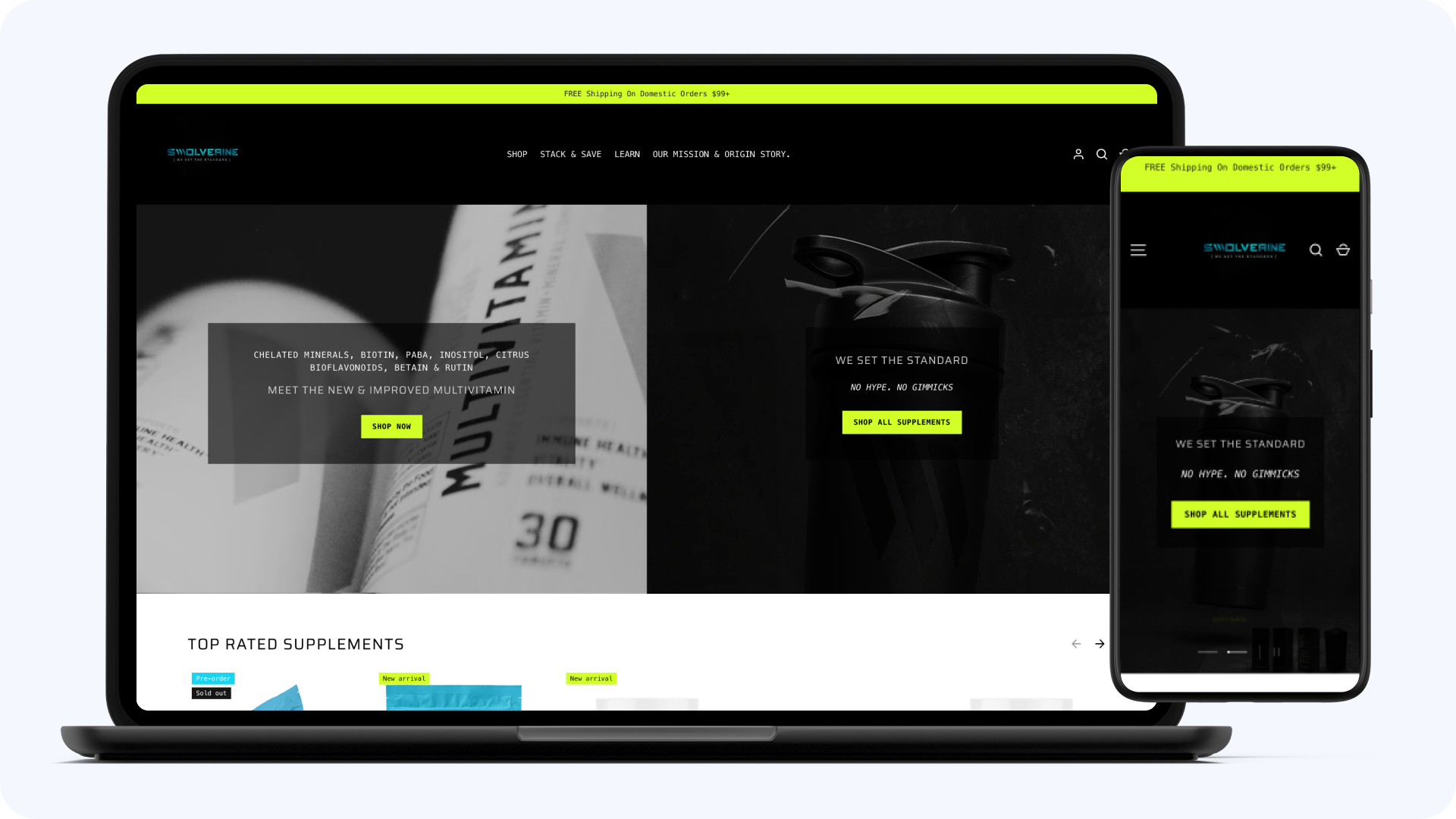
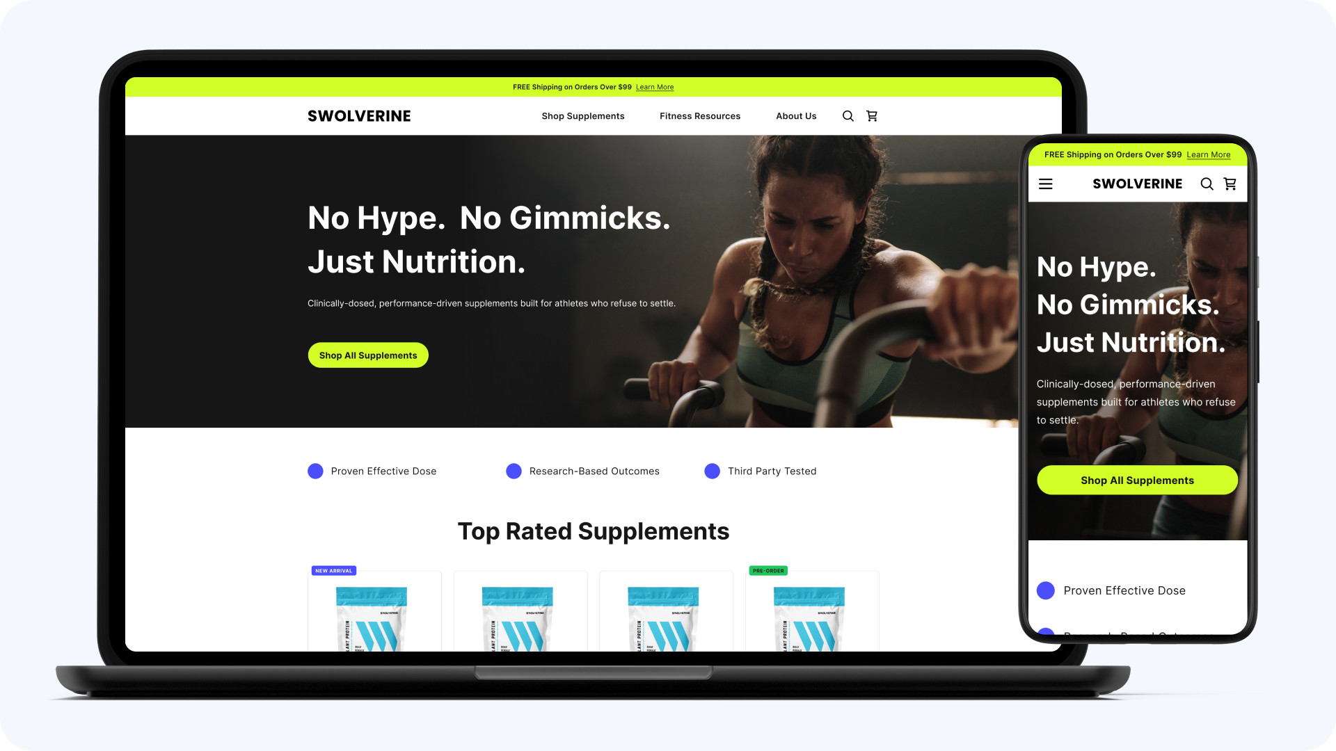
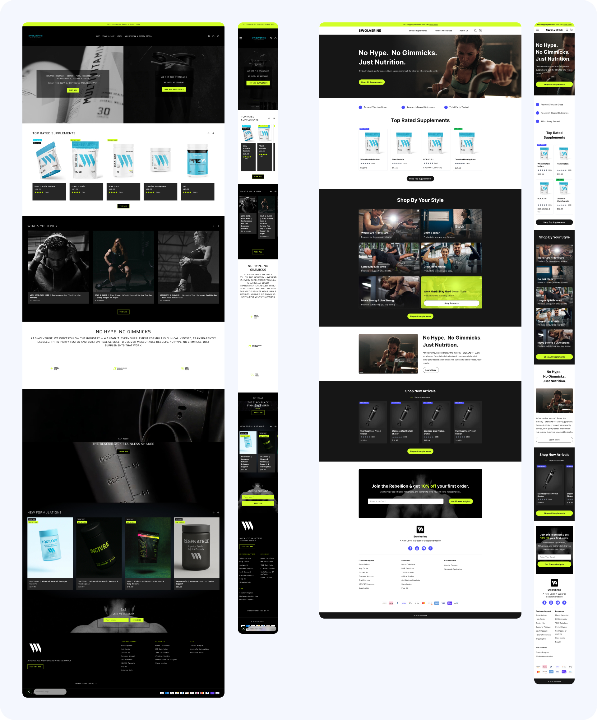
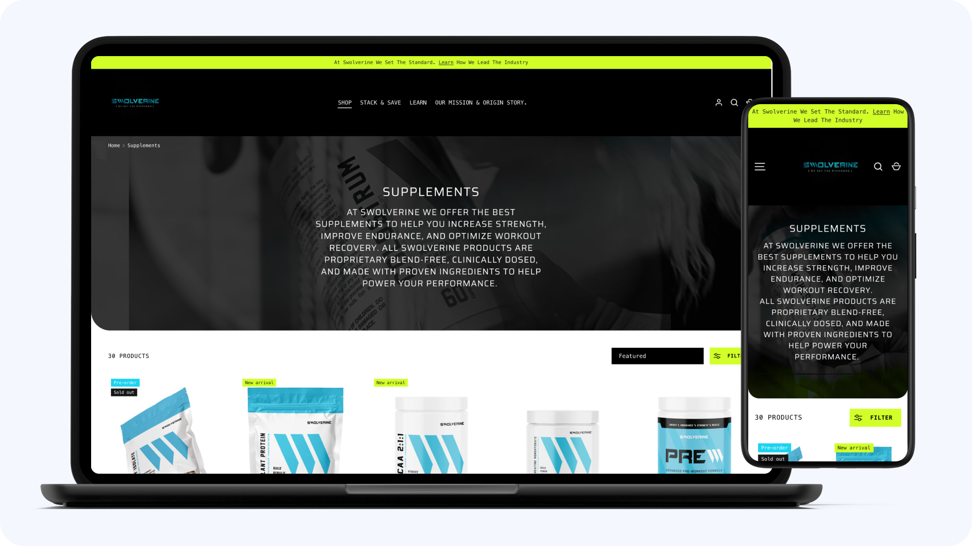
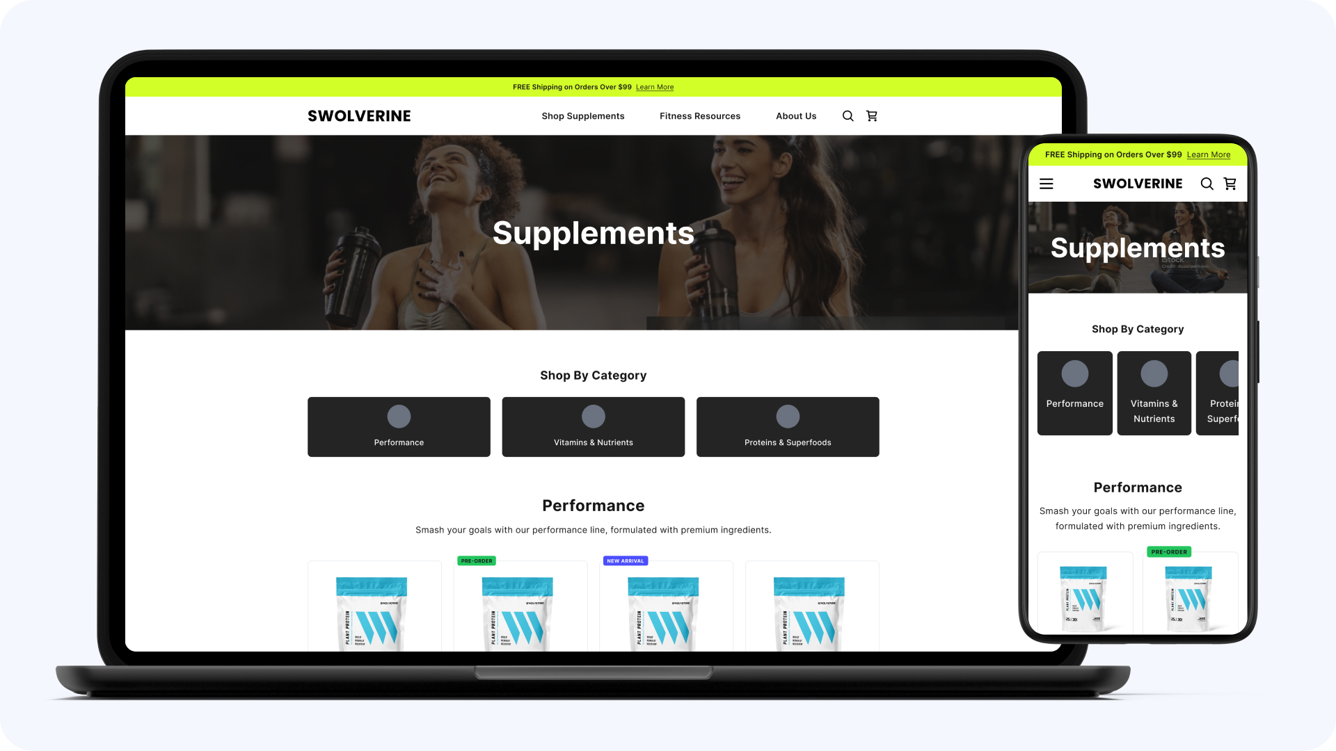
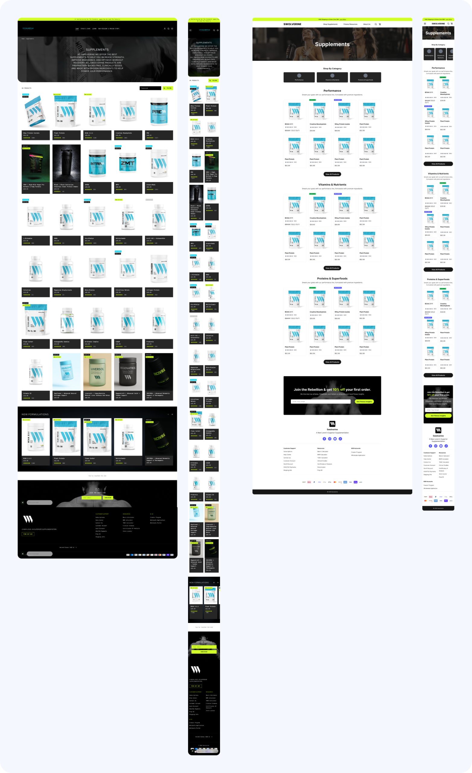
The homepage gave users no clear path toward the products relevant to their goals. I restructured it around category entry points organized by training goal and benefit-driven messaging for featured supplements.
Navigation & Product Discovery
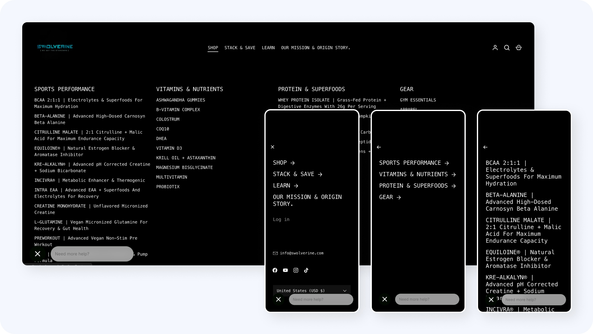
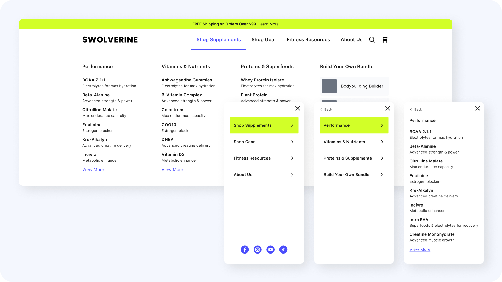
The catalog spans proteins, pre-workouts, recovery, and more, and the old navigation treated them all the same. I reorganized it so users narrow by goal, category, or product type, with labels that match how athletes think about supplements.
Product Detail Experience
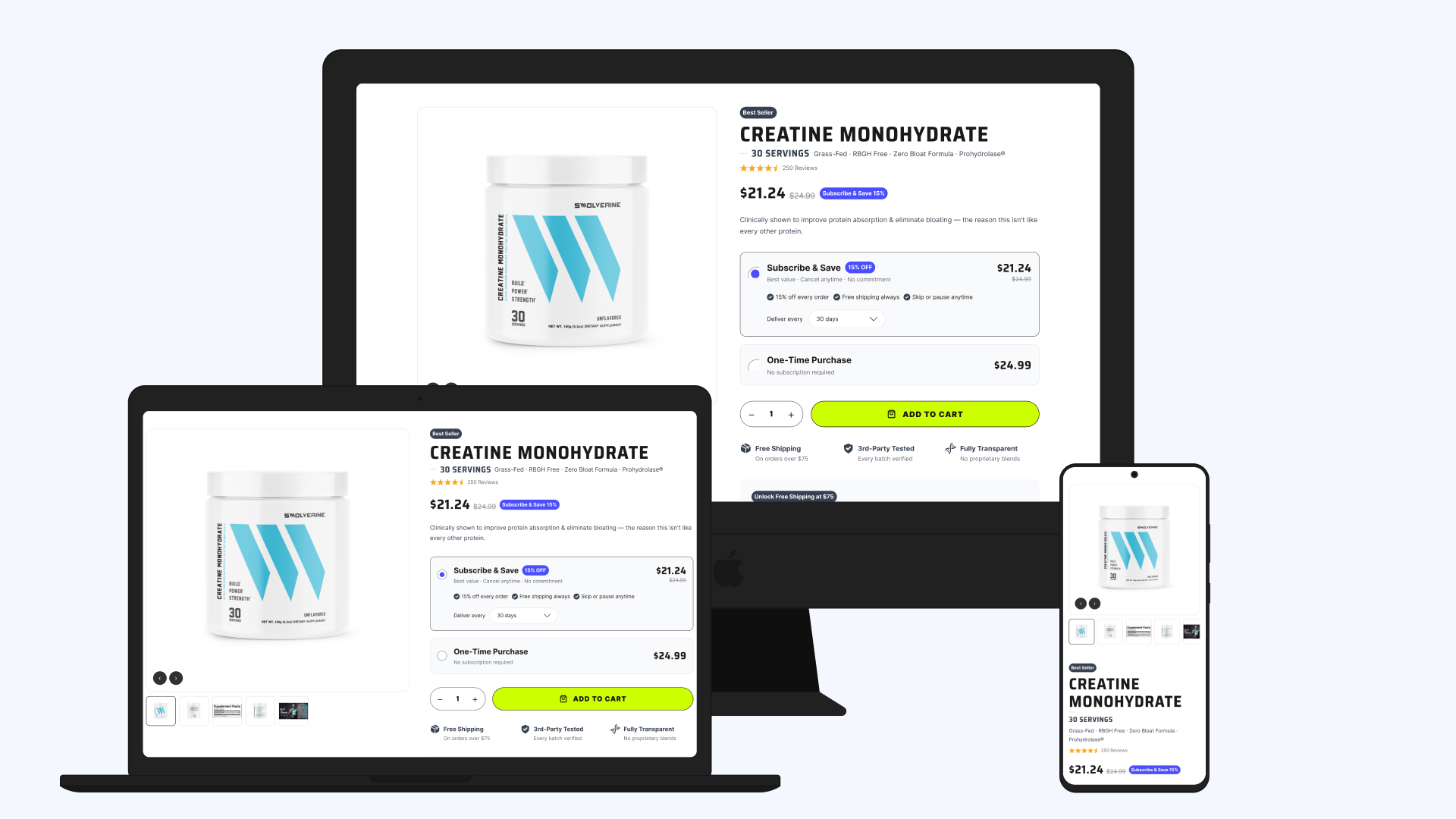
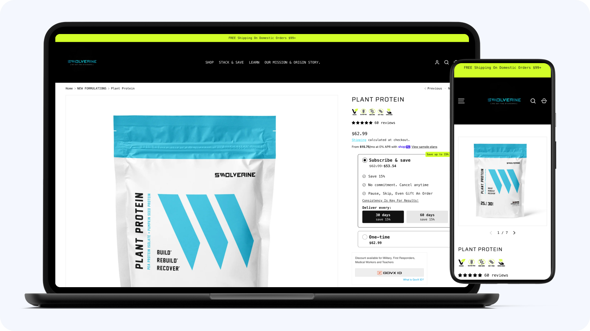
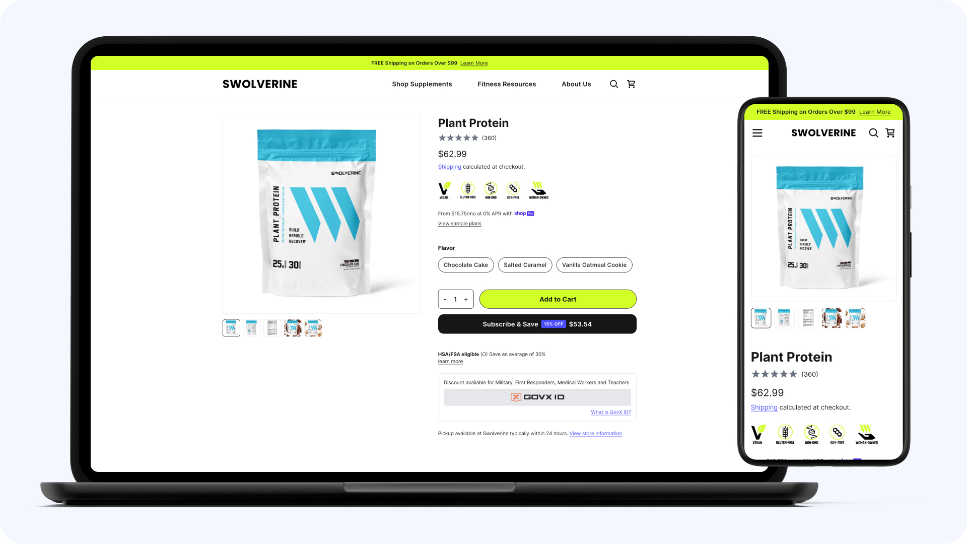
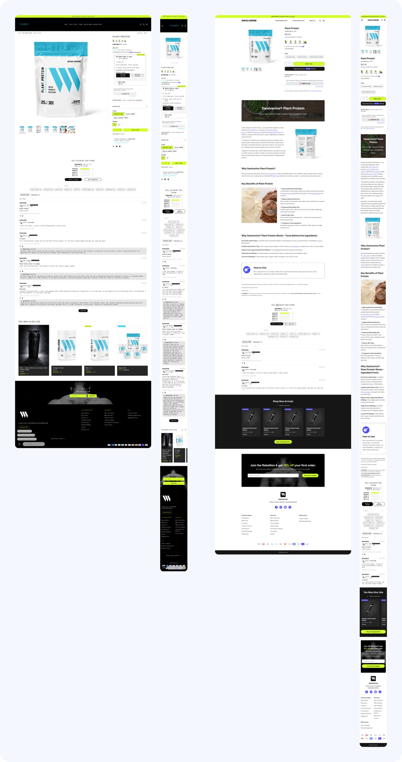
The most important surface to get right. I redesigned the PDP to make ingredient education the center of the page: expanded ingredient breakdowns with benefits and dosing explained, trust indicators, and comparisons users can make without leaving the page.
Where It Stands
The redesign is in engineering handoff now, shipping in stages. The specs are built the way I build them for every team: tight enough that engineers aren’t coming back with questions. What exists today: a full audit, a redesigned experience across homepage, navigation, PDPs, cart, and checkout, a revamped subscription flow, and a foundation designed to scale as the catalog grows. Results belong on this page when they’re real, and they’ll be added when the data is in.
The Tradeoffs
The audit surfaced fixes we could have shipped piecemeal in weeks. We chose the connected redesign instead, because the problems compounded across surfaces: better PDPs don’t matter if navigation can’t get you to them. The cost is real and I’d name it in any room: months of design investment before a single conversion improves. The handoff is sequenced so engineering ships in stages rather than waiting for one big cutover.
What It Changed
Even pre-launch, the work changed how the brand operates: the audit gave Swolverine its first shared map of experience problems, the redesign gave it a design foundation that can absorb new products without another overhaul, and the staged handoff gave engineering a sequence instead of a pile. When the numbers come in, they’ll land on top of a structure built to be tested, because it’s joining the same experimentation program as the rest of the portfolio.
AI on This Project
- The audit run through my redesign-audit skill: issue-first findings, annotated directly in Figma
- Handoff specs written into Figma with my dev-handoff skill, requirements and dev spec as annotation frames
- PDP and navigation variants iterated with Claude and Figma MCP before anything went to spec
Additional Pillar4 Work
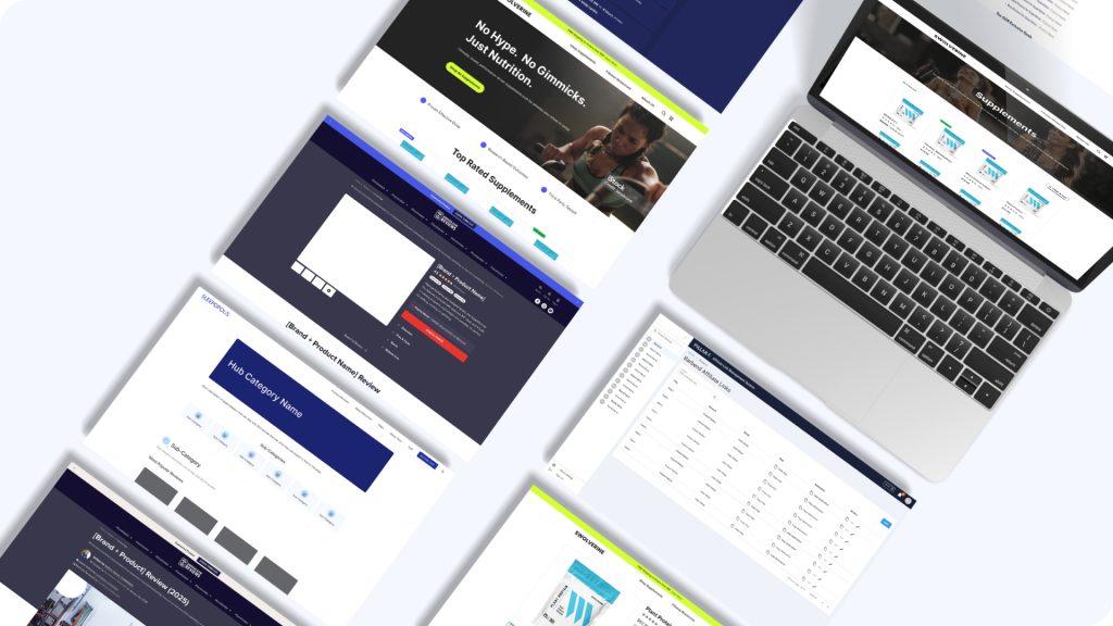
Pillar4 Media
The design function, the experimentation program, and the AI workflow across the full 20+ brand portfolio.
Measurable Revenue
A/B Tests Run
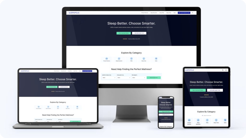
Sleepopolis
I lead UX strategy and experimentation for a high-traffic sleep affiliate platform. This is where the experimentation playbook was built.
Revenue Growth
Winning Tests
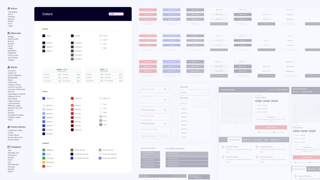
Garage Gym Reviews
The proof the playbook transfers. I set UX direction for the fitness equipment review platform, delegated detailed design, and shipped the site’s first product pages.
Revenue Growth
Winning Tests
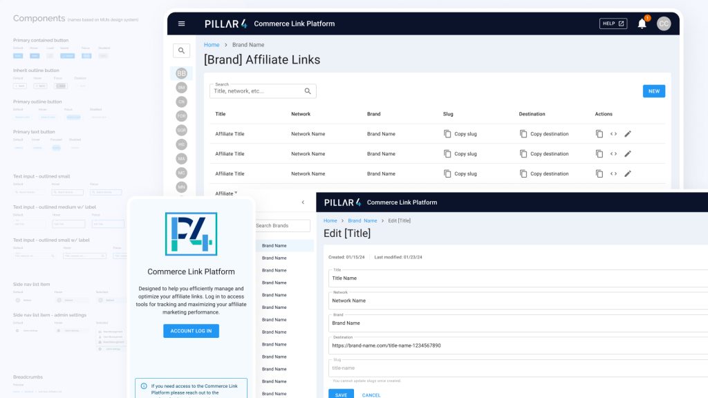
Commerce Link Platform
An internal platform that replaced manual link tracking across every Pillar4 brand.
Using Daily
of Truth