

BowFlex Ecommerce
Role
UX/UI Designer; established BowFlex’s first Web UX practice
Scope
BowFlex ecommerce end to end, within a 6-brand portfolio
Tools
Figma, usability sessions, competitor evaluations
Timeline
2018 – 2023
When I joined BowFlex there was no dedicated UX practice for the web experience. I established the company’s first Web UX practice and spent five years leading UX across six brands: BowFlex, JRNY, Schwinn Fitness, Nautilus, Octane Fitness, and Modern Movement. This case study covers the BowFlex ecommerce redesign: rebuilding how people buy high-ticket fitness equipment, while standing up the practice that made the rebuild possible. Two jobs, at the same time.
Web UX Practice at BowFlex
Homepage Through Post-Purchase
One Design Practice
The Problem
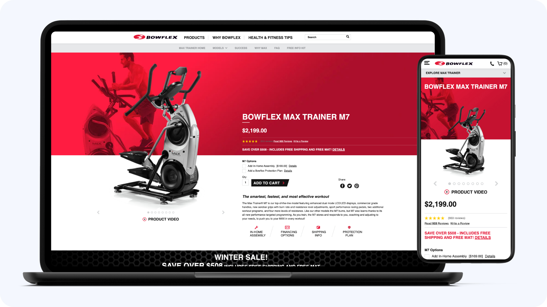
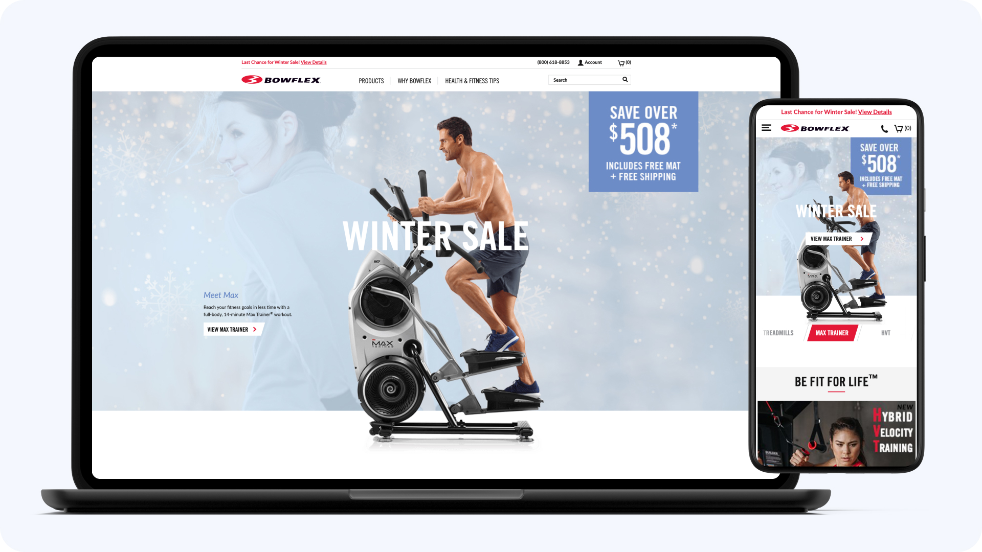
The ecommerce site looked and felt like it was built five years before users landed on it, and the purchases it had to carry are among the hardest in consumer ecommerce: high-ticket equipment, long consideration cycles, research that starts on a phone and finishes on a desktop, and a checkout that has to handle financing, delivery logistics, and accessory add-ons without collapsing under them.
What the Purchase Involved
- High-ticket equipment with long consideration cycles
- Comparison across models, price points, and features
- Financing, delivery scheduling, and add-on accessories
- Mobile research finishing in desktop purchases
What the Site Did With It
- Interaction patterns years behind modern ecommerce
- Navigation that didn't map to how buyers think
- Weak comparison tools for a comparison-driven purchase
- No UX practice to fix any of it systematically
What I Did
The bet: high-consideration buyers don’t need persuasion, they need help deciding. Every surface got rebuilt around the decision, not the pitch. And behind the surfaces, a bet on process: establish patterns and standards so the practice would outlast any single redesign.
Ecommerce Platform Modernization
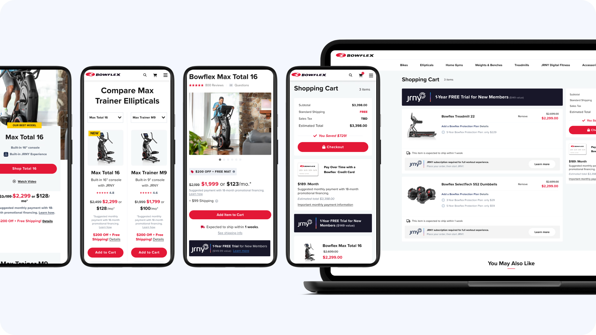
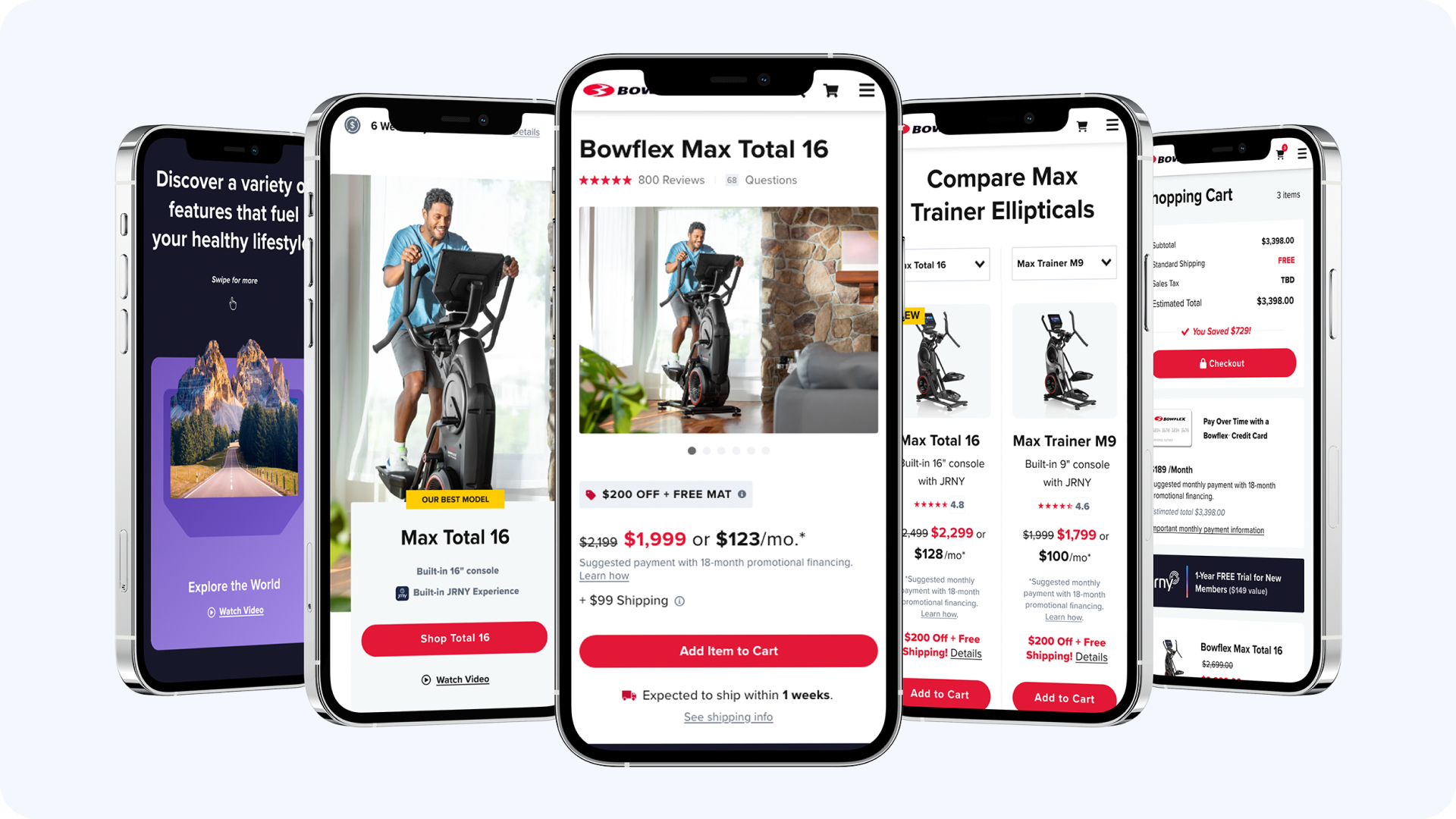
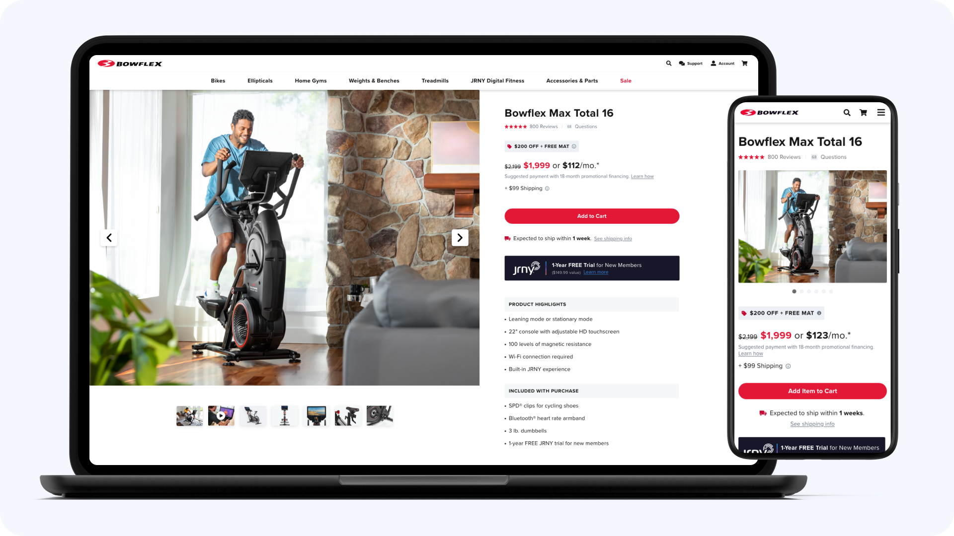
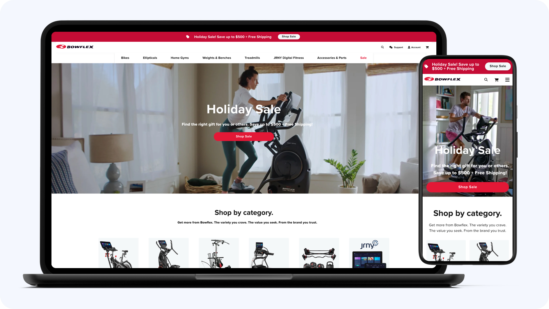
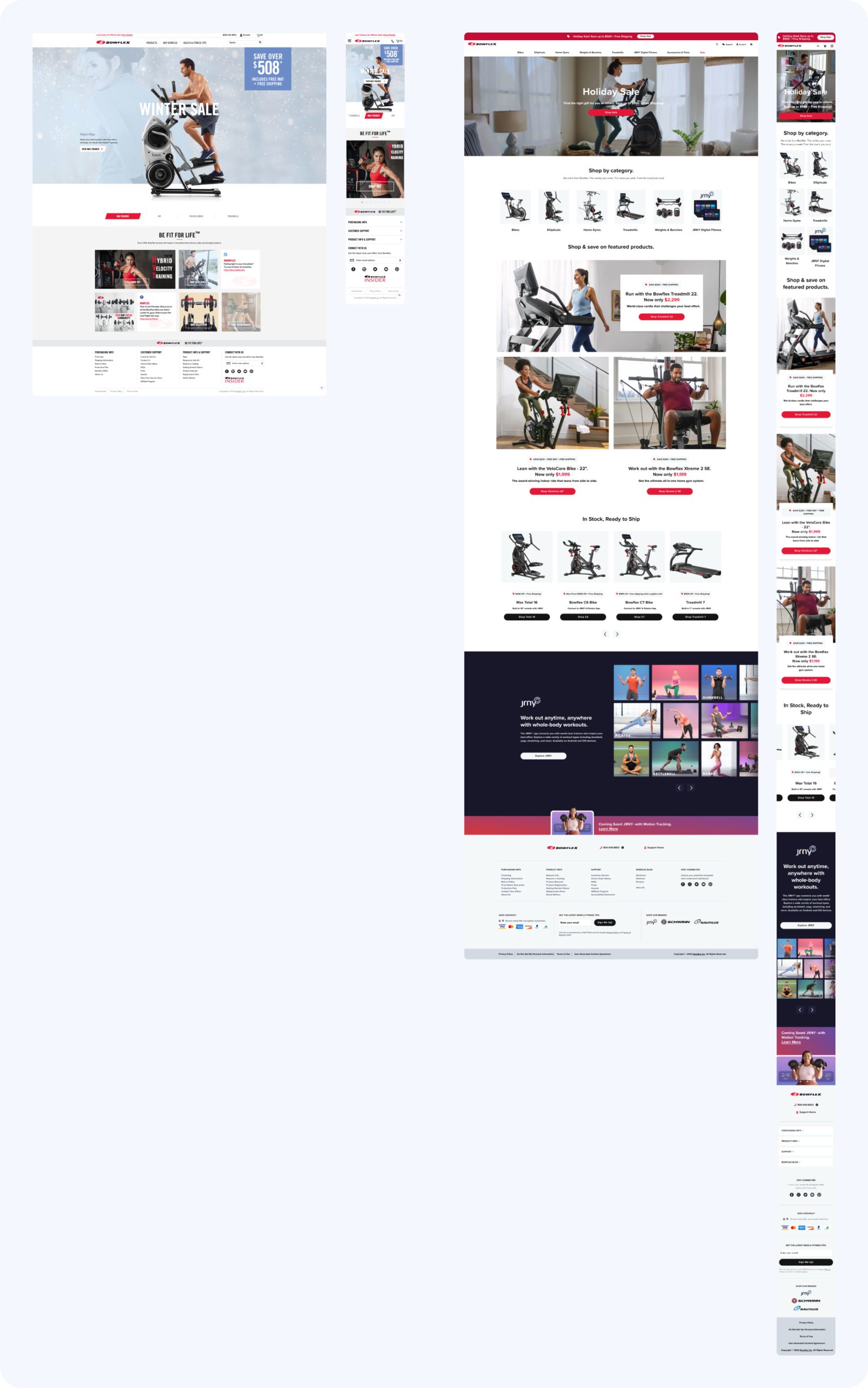
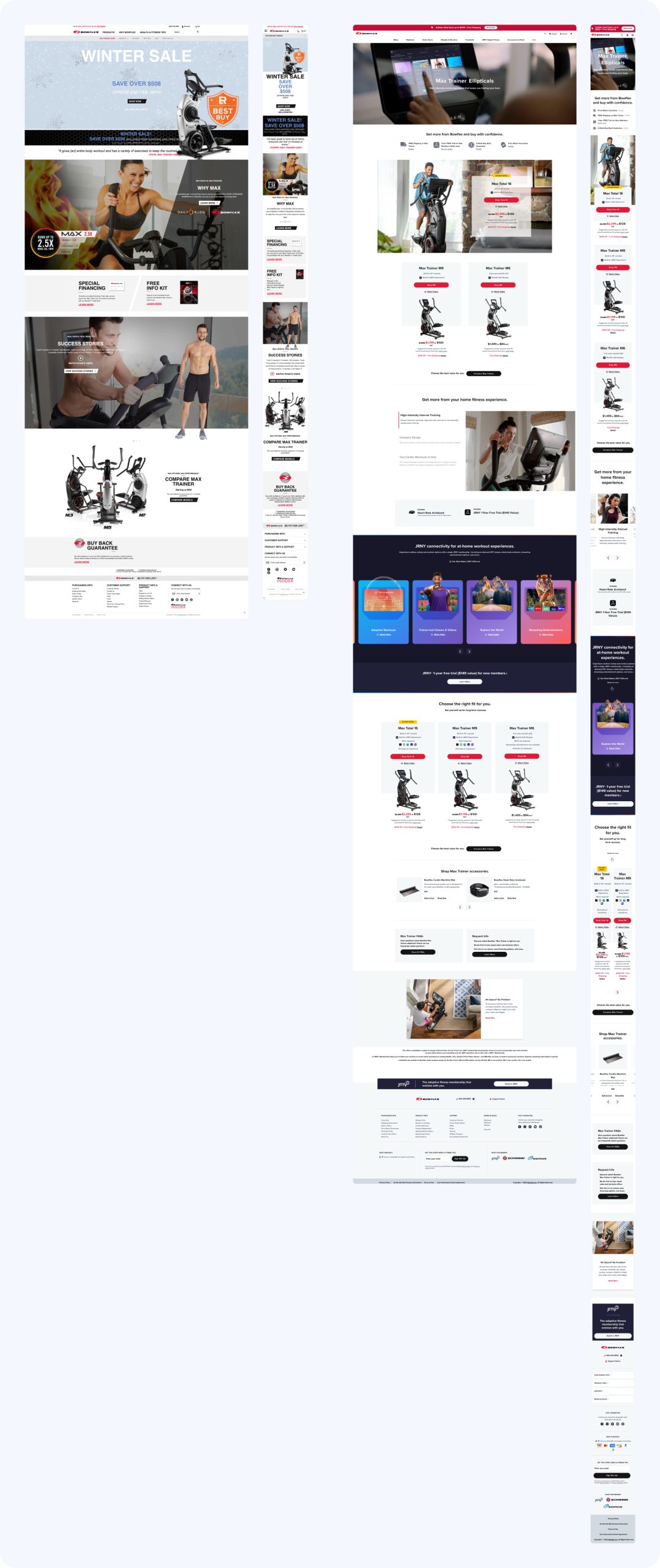
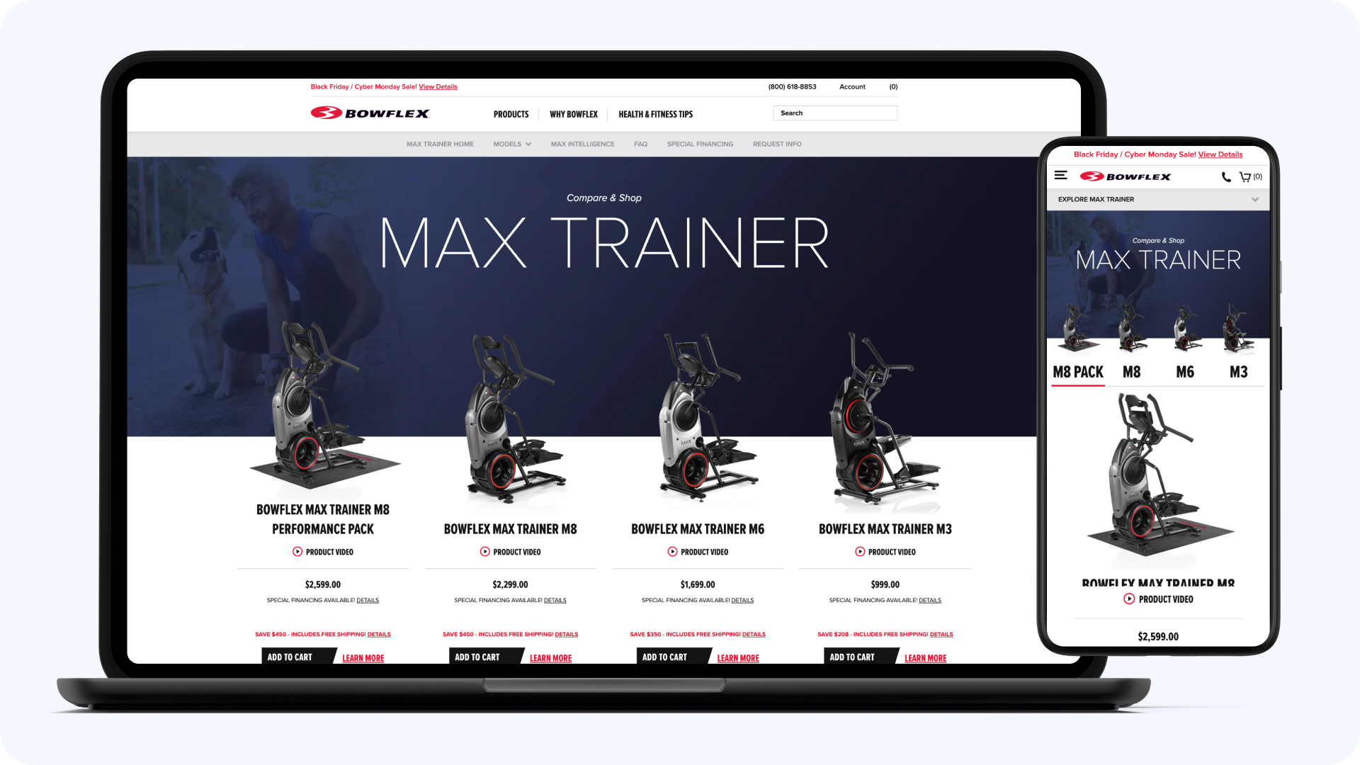
I led the homepage redesign and established the mobile-first layout patterns that carried across every other page. This is also where the practice itself got built: the patterns, review habits, and usability sessions from this redesign became the standard for all six brands.
Product Discovery & Navigation
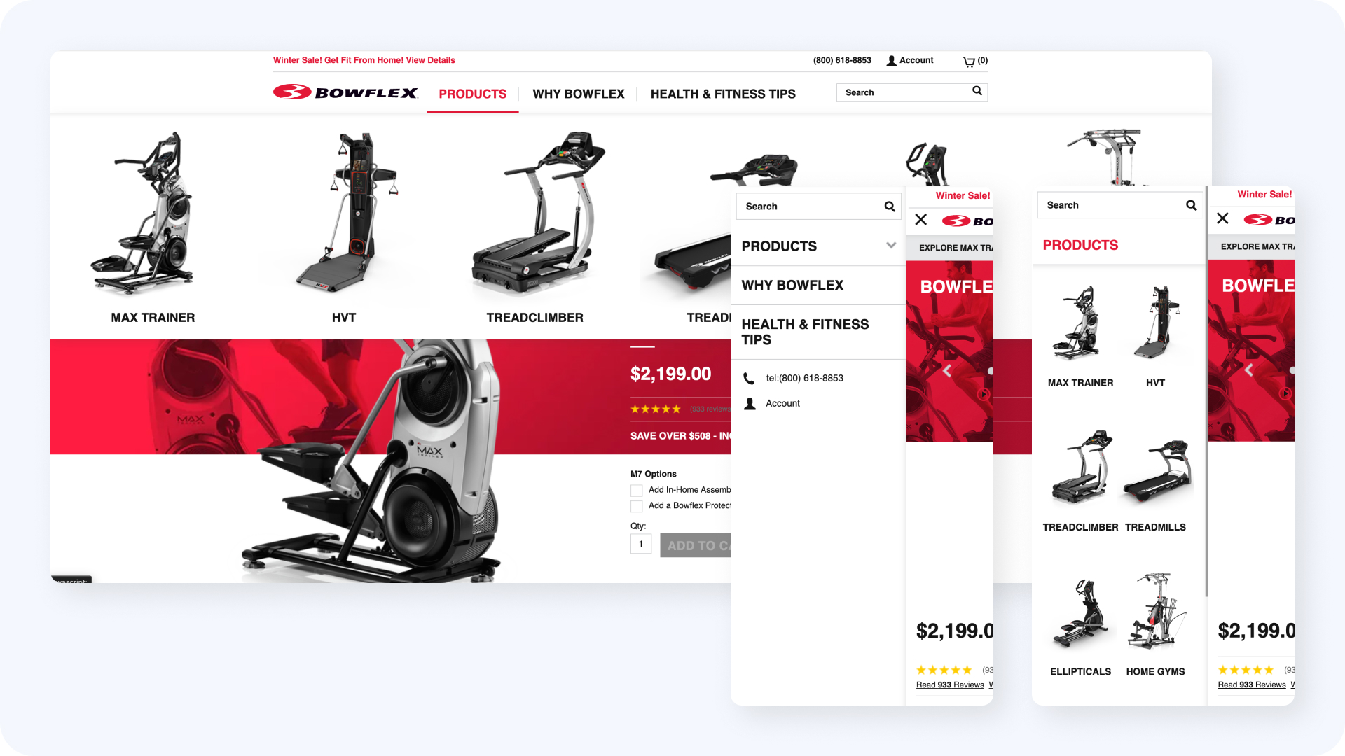
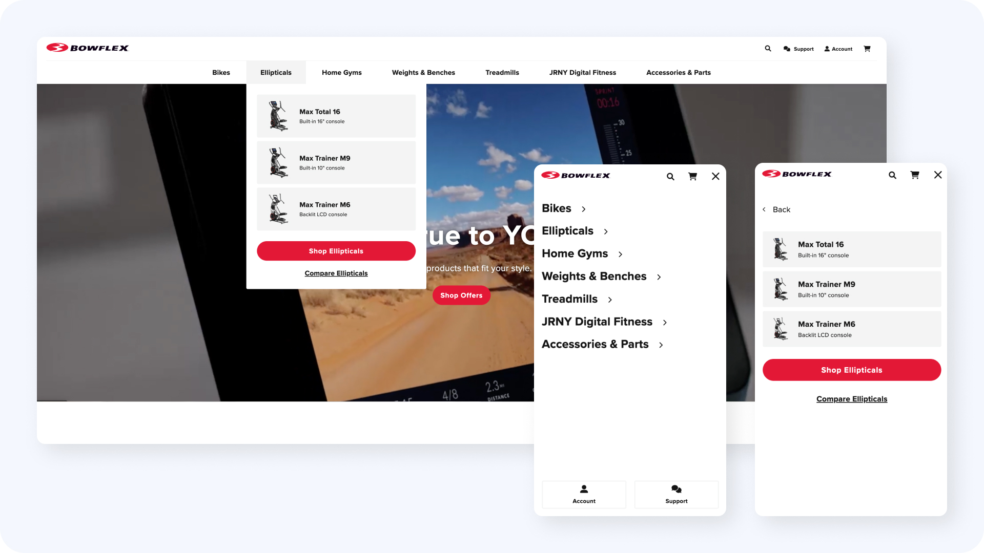
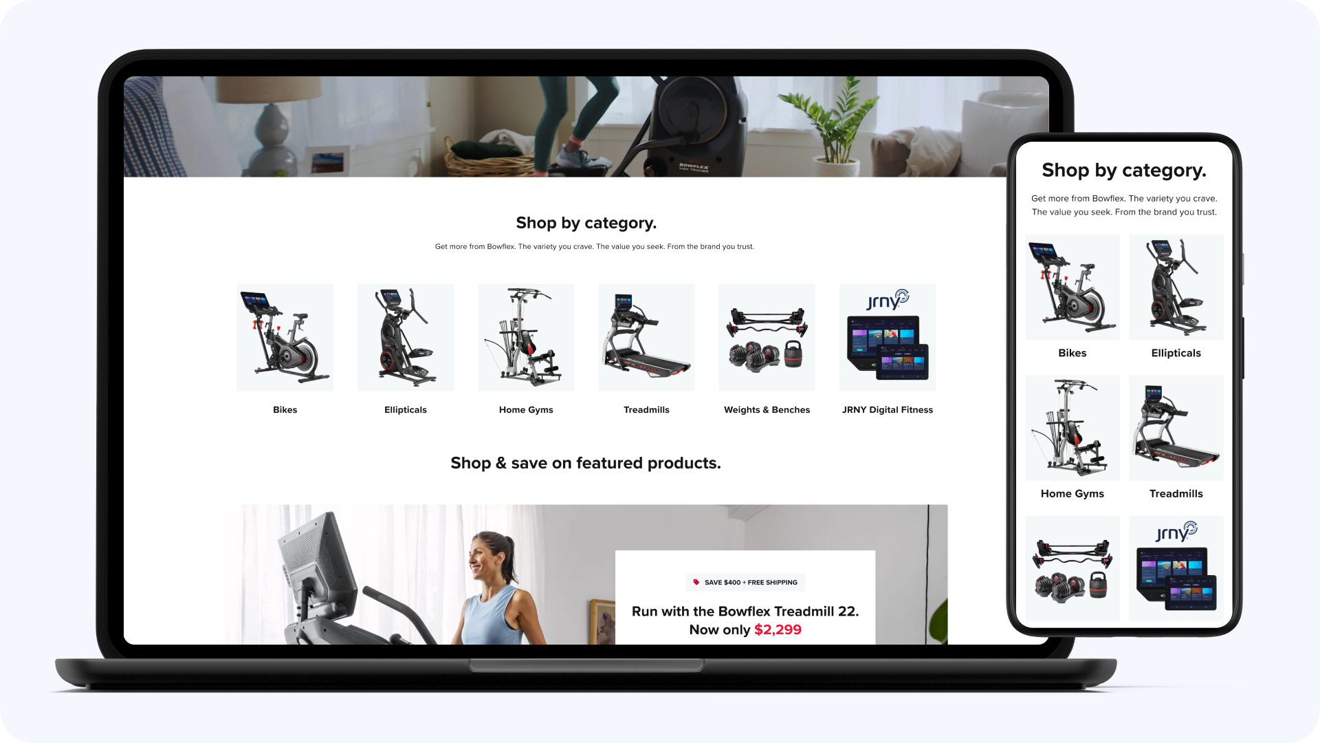
BowFlex sells everything from adjustable dumbbells to full home gyms, and the navigation didn’t reflect how people think about that range. I restructured it around fitness goals and equipment types, with simplified labels organized around intent and clearer pathways from browsing to a specific product.
A $2,000 Treadmill Isn't an Impulse Purchase
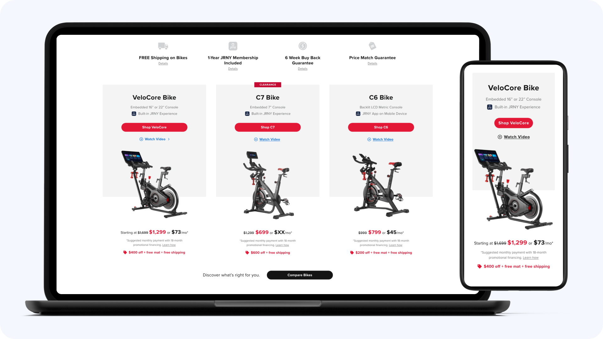
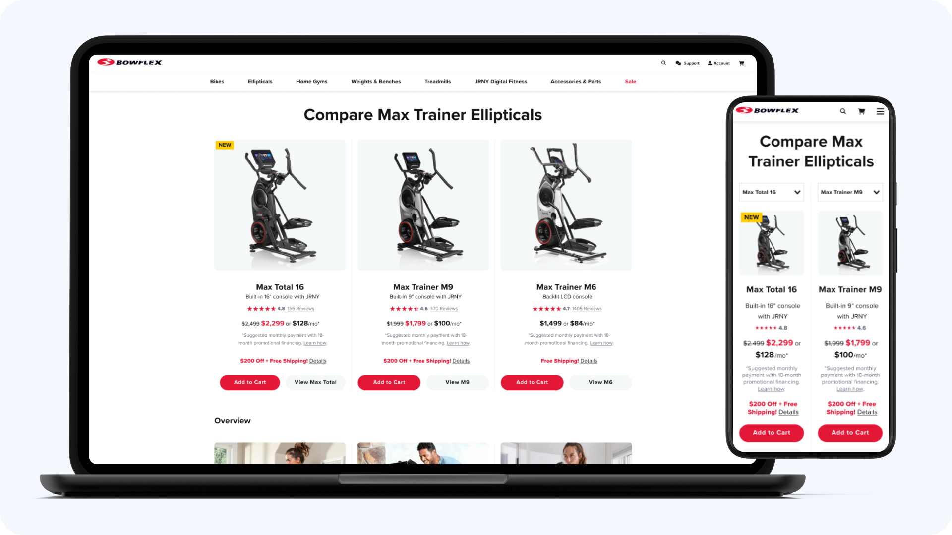
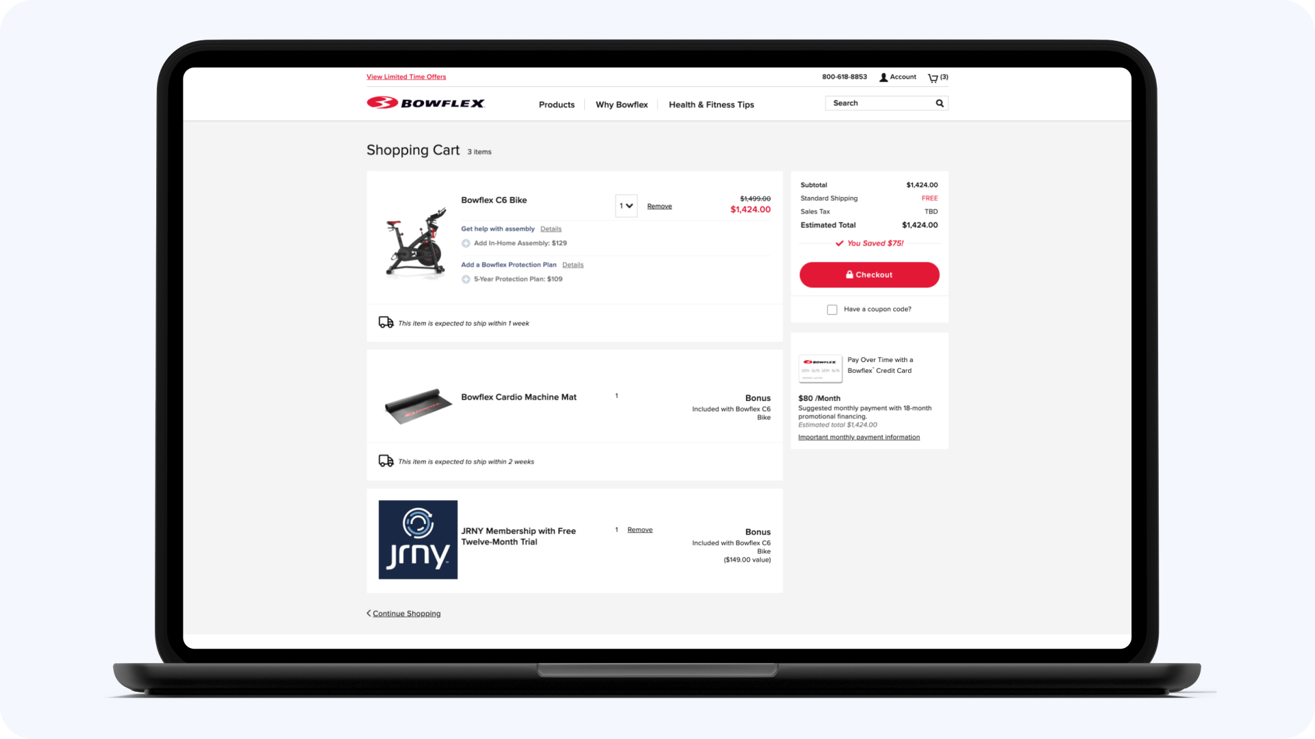
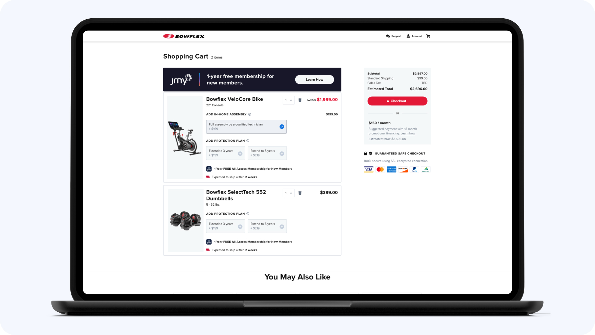
The two surfaces that decide a high-consideration sale are the comparison and the checkout. I redesigned comparison and product detail pages so buyers could evaluate models side by side with the information that actually matters, purchase-critical details above the fold. Then the checkout: financing, delivery scheduling, and add-ons tempt every designer to tuck complexity behind “you’ll sort this later.” We kept it in the flow and made the flow carry it, because a surprise at delivery scheduling is how a $2,000 order becomes a $2,000 return.
The cost was a longer checkout than the sleek version we could have shipped. The win was buyers who knew exactly what they’d agreed to.
The Tradeoffs
Standing up a practice while shipping a redesign means something gets starved. [The practice-building trade: what got less than it deserved, why you chose that, and what it cost. One paragraph from you.] The checkout carried its own trade too: complexity absorbed into the flow instead of hidden behind it, longer on screen, cleaner at the doorstep.
What It Changed
The practice outlasted the project, and the project outlasted me. After I left, BowFlex went through a broader brand refresh that updated the visual identity across the site. The visual design has evolved, but the core UX foundations I introduced continue to power the current ecommerce experience. Skins change. Structure, if you get it right, stays.
Additional Work
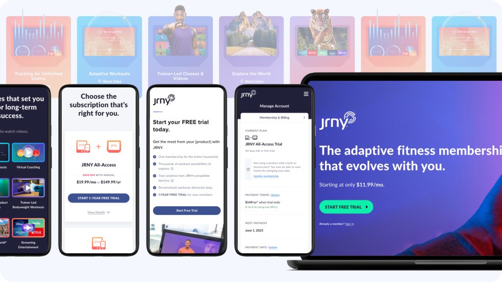
JRNY Connected FItness Platform
The other half of the BowFlex story: the connected fitness platform’s web experience, from 0 to 1.
Platform Members
Paid Subscribers
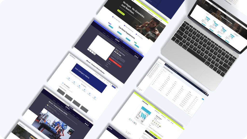
Pillar4 Media
The design function, the experimentation program, and the AI workflow across the full 20+ brand portfolio.
Measurable Revenue
A/B Tests Run
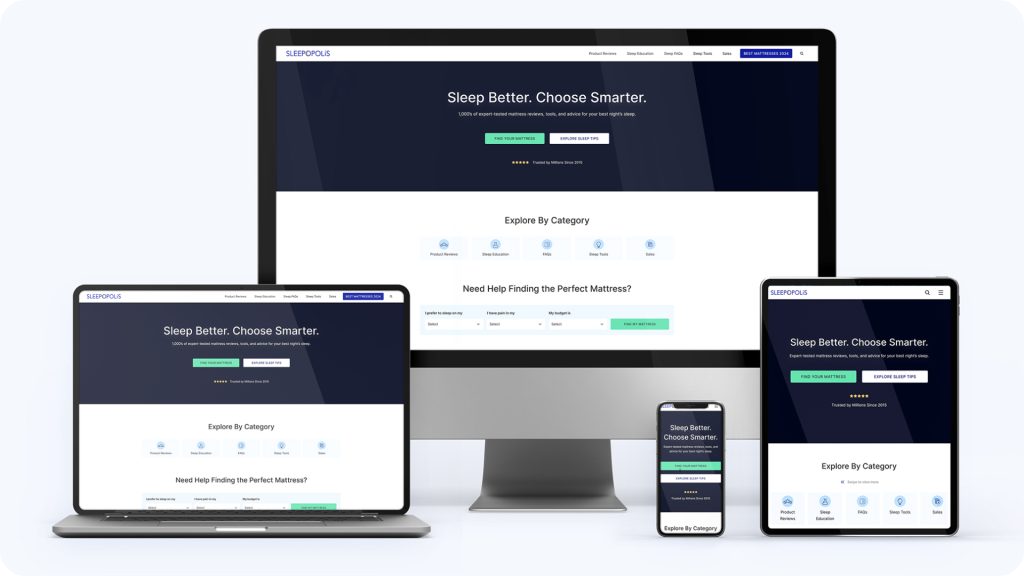
Sleepopolis
The proof the playbook transfers. I set UX direction for the fitness equipment review platform, delegated detailed design, and shipped the site’s first product pages.
Revenue Growth
Winning Tests