

Garage Gym Reviews
Role
Senior Product Designer, UX direction (detailed design partly delegated)
Scope
High-intent fitness equipment review platform
Tools
Figma, Claude, Claude Code, Figma MCP, Mouseflow
Timeline
2023 – Present
Garage Gym Reviews is a fitness equipment review platform with a deeply engaged community of home gym builders, from beginners buying a first kettlebell to lifters speccing full rack setups. I led UX strategy and experimentation across the site, setting direction for designers executing the detailed work. The program shipped 18+ winning tests, $5M+ in incremental revenue, and the site’s first product pages.
Incremental Revenue
Avg. Conversion Lift, All Tests
Avg. RPV Lift, All Tests
Winning Tests
The Problem
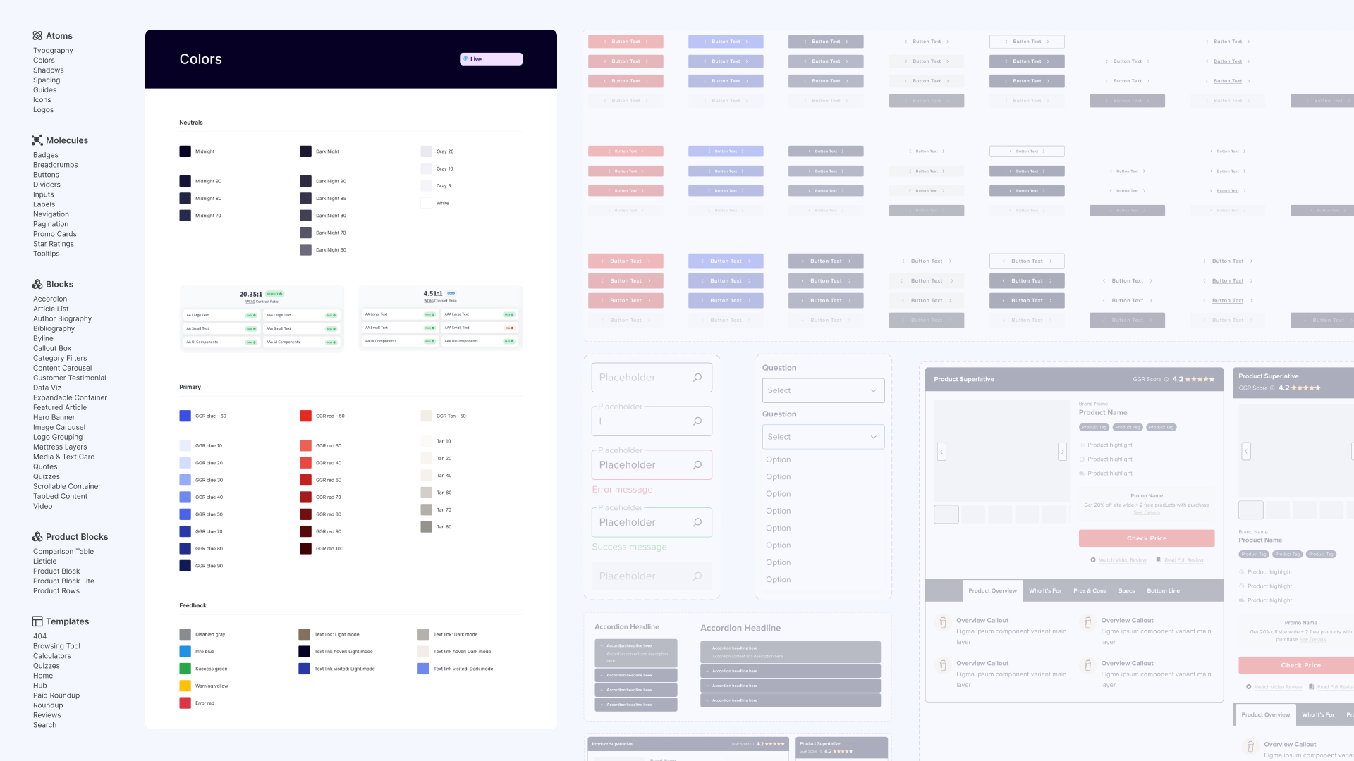
The content earned deep community trust, but the structure slowed decisions. Dense long-form reviews buried the product information, hierarchy didn’t survive on mobile where the audience actually read, and there were no product pages at all: everything a buyer needed lived scattered across articles. The job: help both ends of the audience spectrum get from research to a confident purchase without breaking the editorial trust that made the site worth visiting.
What Made the Money
- High-intent organic traffic from equipment searches
- Community trust and brand loyalty
- Specific, detailed product recommendations
What Got in the Way
- Product hierarchy buried in long-form content
- A desktop reading experience for a mobile audience
- Dense reviews that slowed decision-making
- No product pages anywhere on the site
What I Did
The bet behind the work: coming off Sleepopolis, the playbook would transfer. Behavioral data to find the friction, structured tests to fix it, SEO in the room throughout.
Mobile-First Rebrand
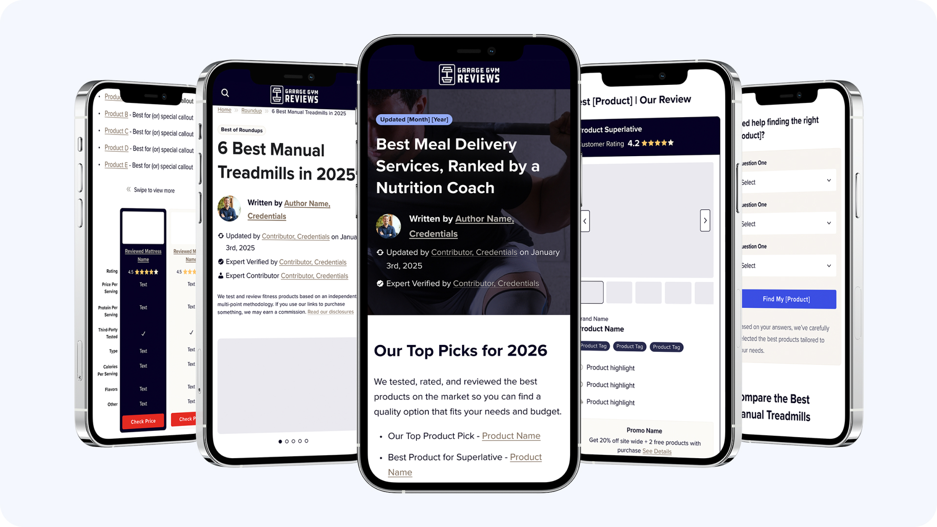
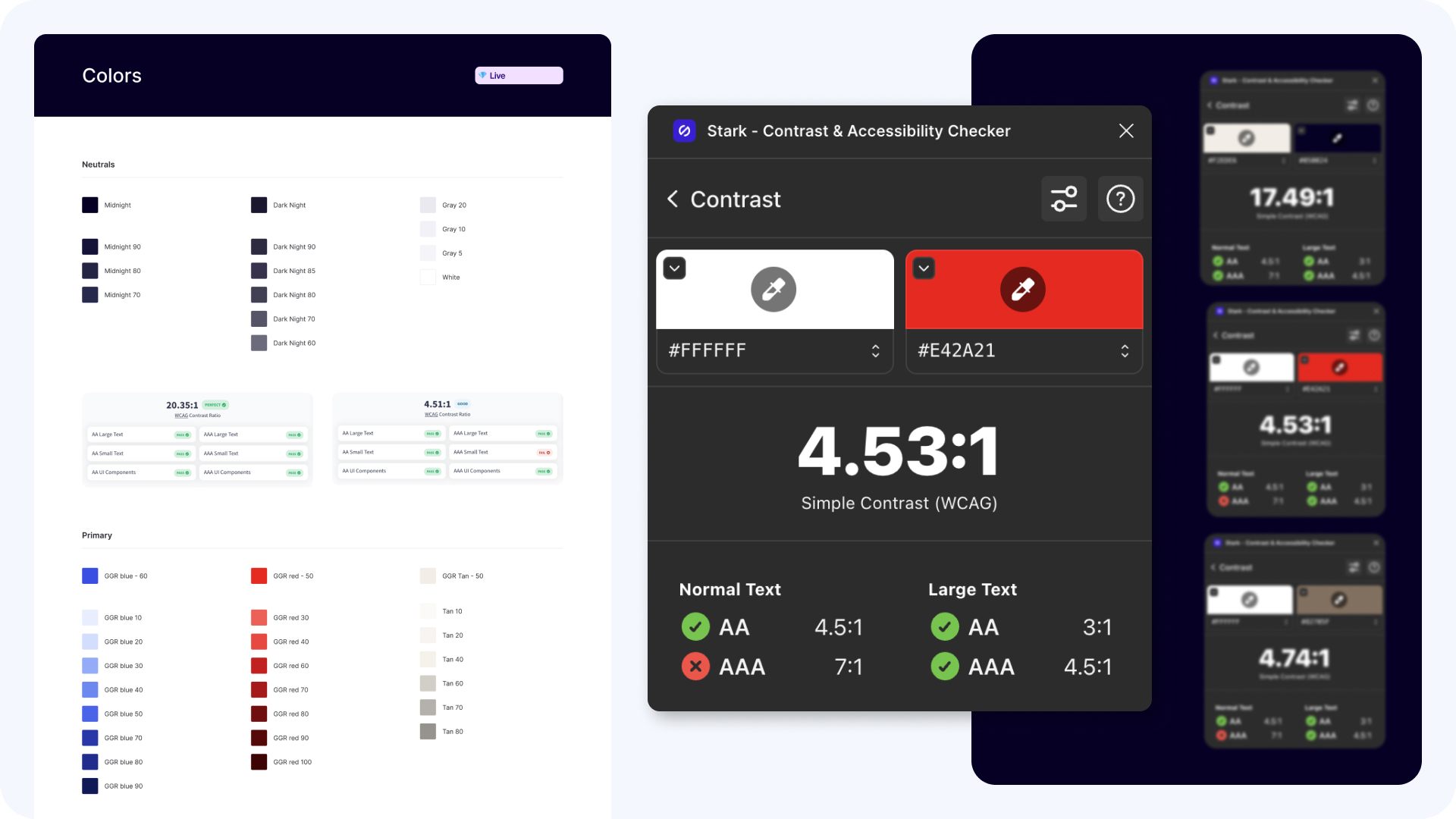
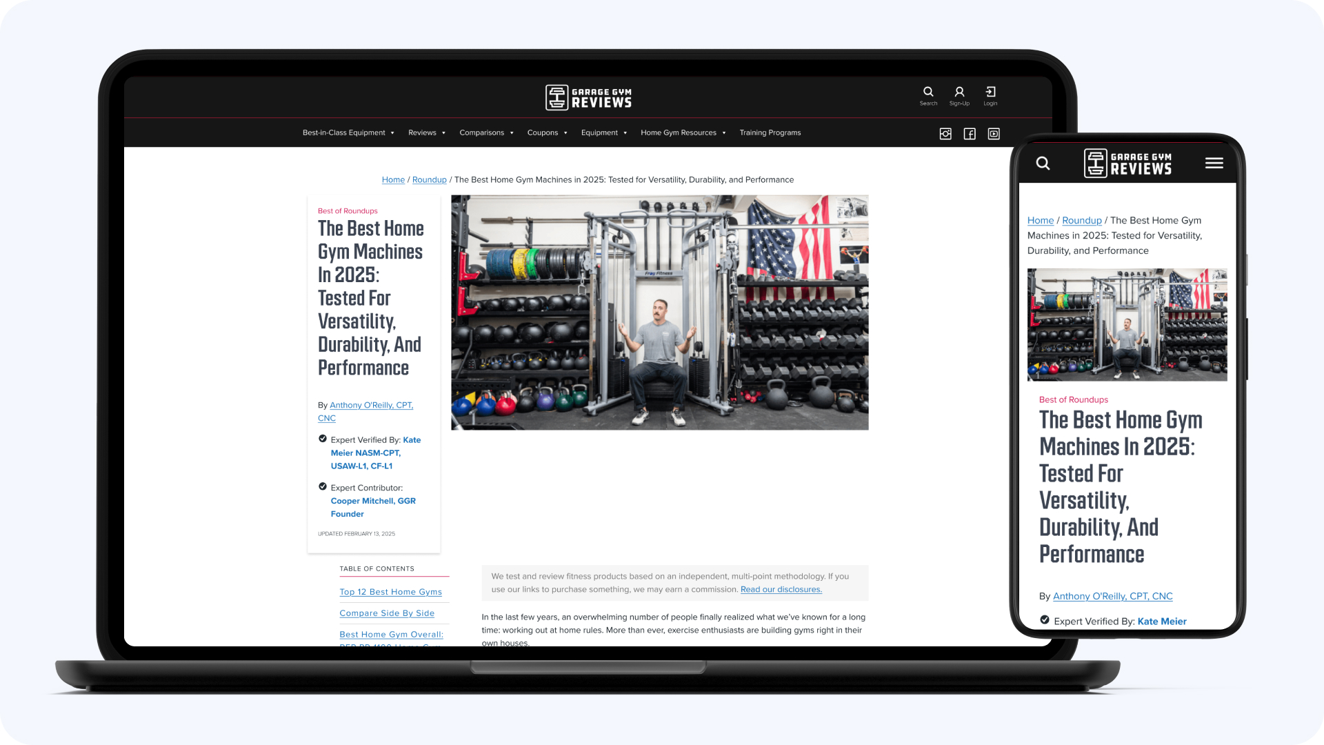
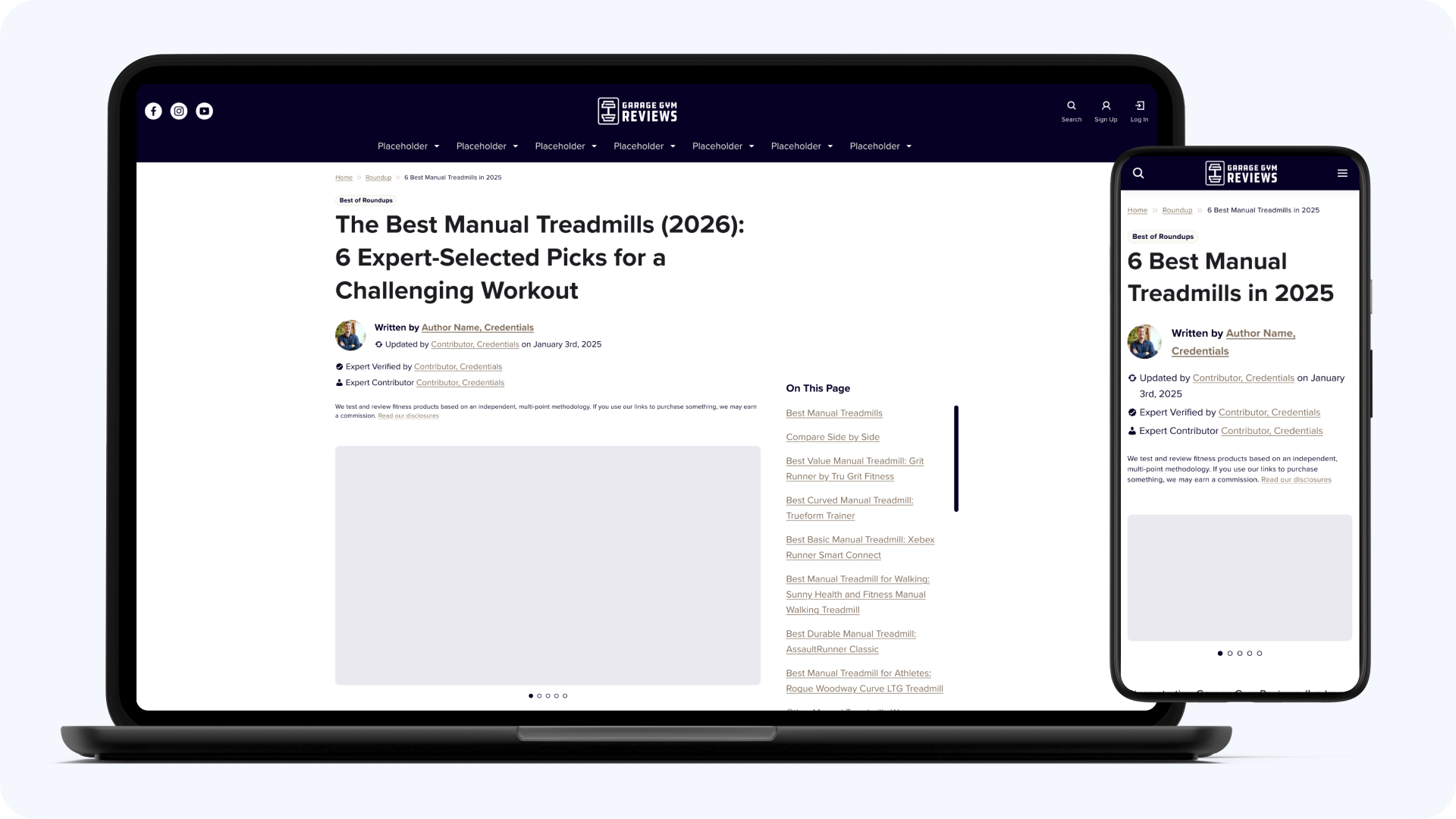
The audience read on mobile; the site was built for long-form desktop reading. I set the UX direction and the patterns, then delegated the detailed design work and reviewed against the direction. That was a deliberate choice: the rebrand needed my judgment more than my mouse, and the designers executing it got a project that stretched them. Product benefits moved higher in reviews, hierarchy got rebuilt for scanning, and the mobile experience stopped fighting the reader.
Product Block Optimization
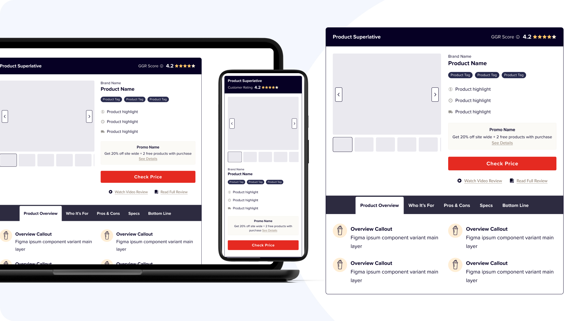
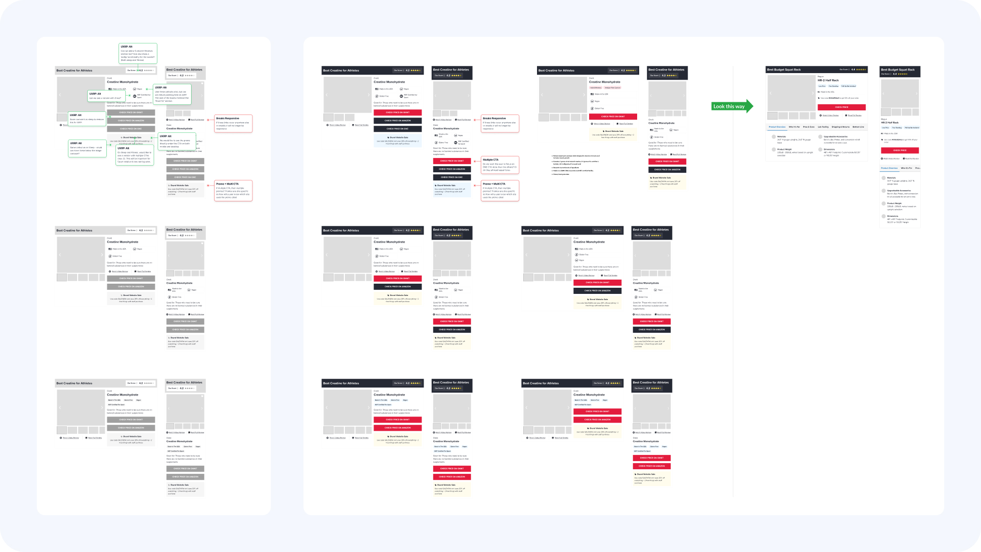
Product blocks are where the monetization happens on review pages. I redesigned them across review and roundup templates: simplified comparison structures, clearer product information, placement driven by behavioral data. Structural variants were iterated with Claude and Figma MCP to shorten every test cycle.
The Site's First Product Pages
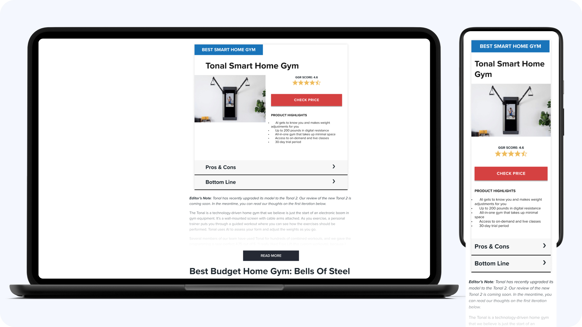
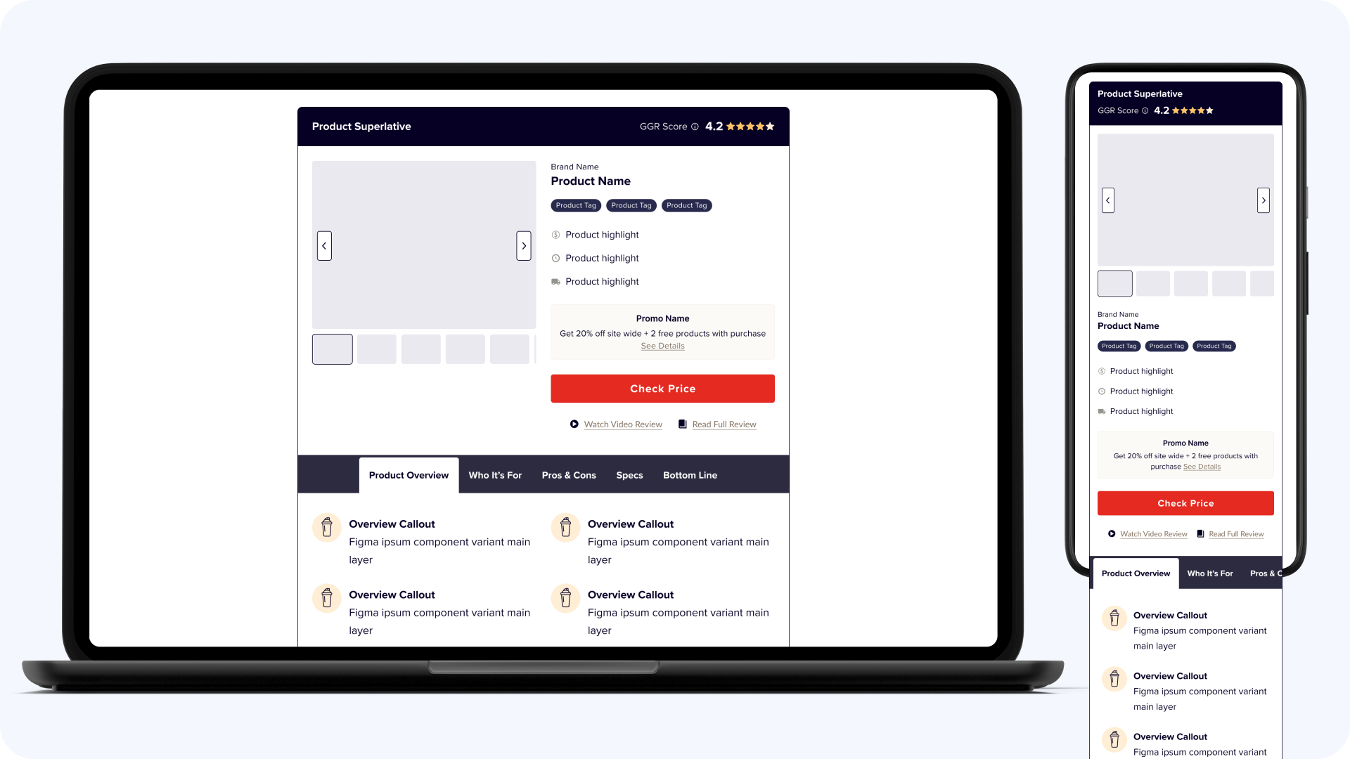
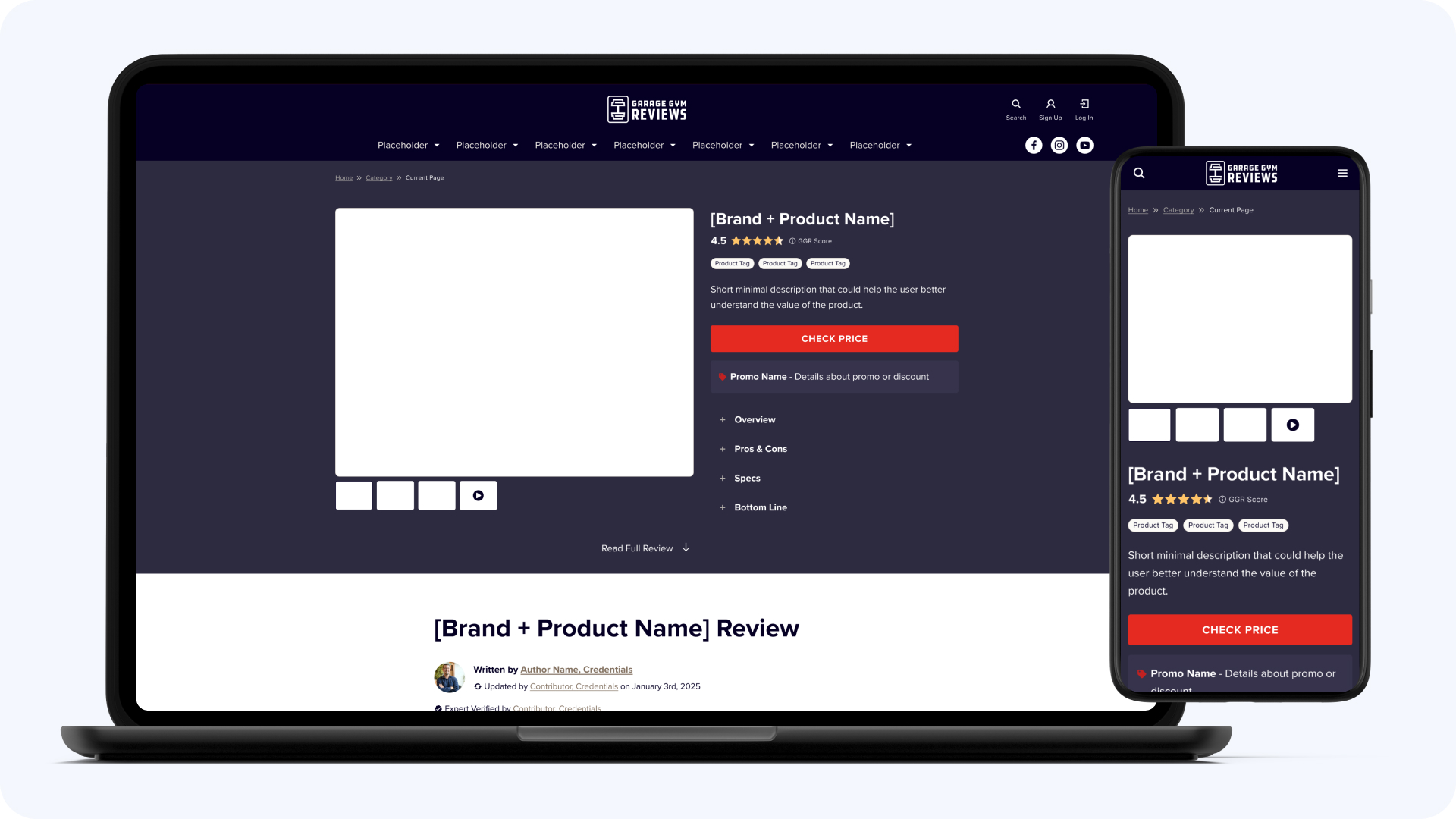
GGR didn’t have product pages. That’s not a gap, it was the site’s structure: all product information lived inside long-form reviews, and users comparing multiple items had to jump between articles. Behavioral data kept showing the same dead end: users bouncing between reviews trying to assemble a comparison the site refused to make for them. The hypothesis: a PDP combining editorial review content with structured product detail would convert better than more optimization of the review templates, even starting from zero ranking history.
The PDPs gave buyers one page for specs, benefits, and performance insights, with the editorial review integrated instead of linked away. Reviews build the trust; the product page converts it. The lifts are that large because the surface is that young: pages with no ranking history yet, converting at nearly double the revenue per visit, with the annual impact still growing as they earn their place in search.
Conversion Lift
Revenue Per Visit
Take Rate
Est. Annual Impact
The Tradeoffs
Building PDPs meant spending months on pages with no ranking history, on a site that lives on organic traffic, instead of squeezing more from review templates we knew worked. The safer play would have moved the average; the PDP bet moved the structure. The delegation had a cost too: early rebrand iterations came back needing more correction rounds than doing it myself would have taken. It paid off the only way delegation ever does, the second project needed half the rounds.
What It Changed
Beyond the averages: +11.7% take rate on high-intent product content, and the best single test hit +110% on conversion. The PDP pattern gave GGR a product surface it can grow into as the catalog expands, and it’s now part of how we think about every content brand: reviews build the trust, structured product pages convert it. The rebrand did its quieter work too. It was the project where I proved to myself, and to the team, that the design function scales through direction, not through me touching everything.
AI on This Project
- Structural variants prototyped with Claude and Figma MCP before anything went to build, shortening every test cycle
- Tests built through the Figma to Claude to Optimizely pipeline in about 30 minutes each, down from 6-8 hours
Additional Pillar4 Work
Pillar4 Media
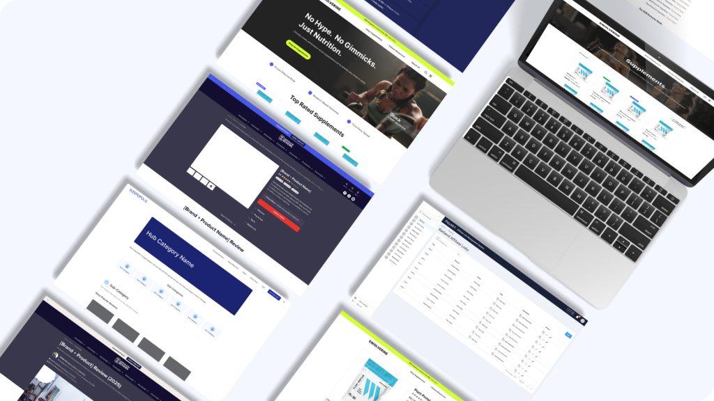
The design function, the experimentation program, and the AI workflow across the full 20+ brand portfolio.
Measurable Revenue
A/B Tests Run
Sleepopolis
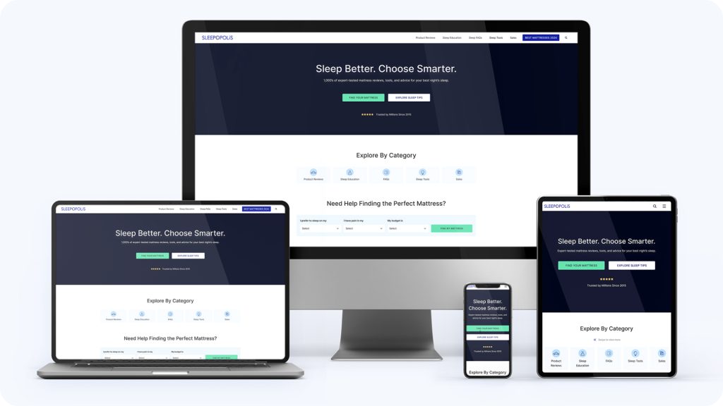
I lead UX strategy and experimentation for a high-traffic sleep affiliate platform. This is where the experimentation playbook was built.
Revenue Growth
Winning Tests
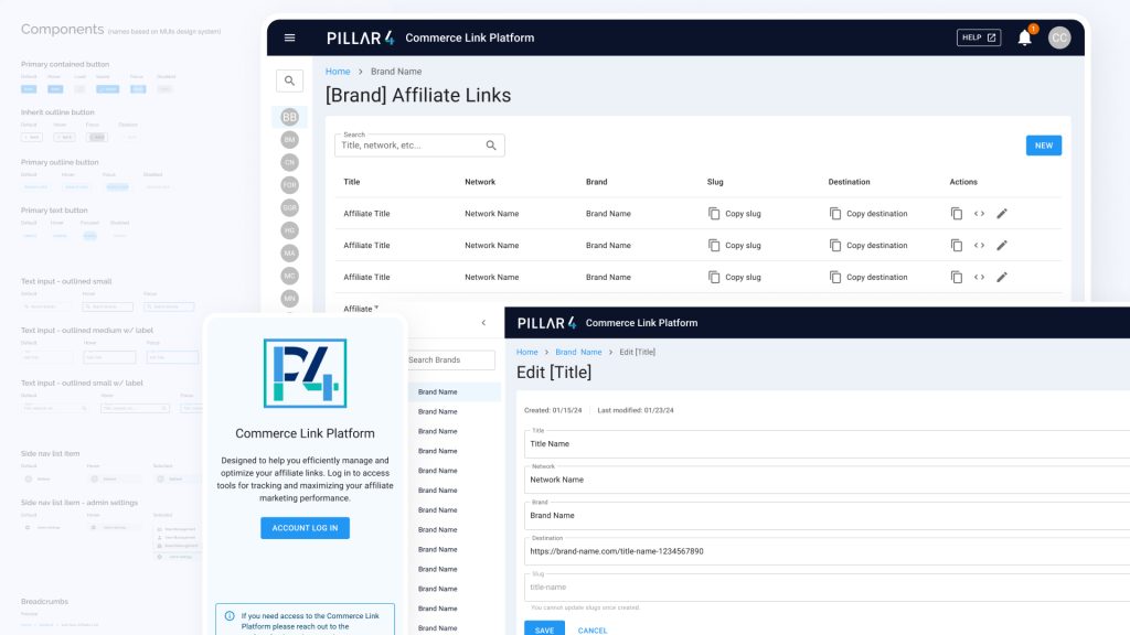
Commerce Link Platform
An internal platform that replaced manual link tracking across every Pillar4 brand.
Using Daily
of Truth
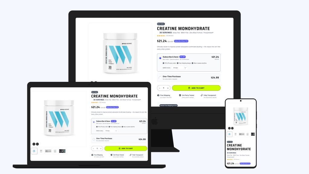
Swolverine
A full UX audit and redesign of a 100+ SKU supplement store, organized around ingredient education: navigation, product pages, and checkout.
SKUs Restructured
Connected Redesign Areas