

Italiano
Role
Product design and direction
Scope
Product strategy, UX and UI, design system, learning model, specs and QA
Tools
Claude, Claude Code, Anthropic API, Next.js, Supabase, Vercel
Timeline
May 2026 – present
Cards
Directions Explored
PRs to Ship the Redesign
Days, Audit to Production
The Problem
My wife and I are learning Italian from the same college textbook, Prego! An Invitation to Italian. We love Italy, and retiring there someday is the long-term plan. Every chapter ends with a vocabulary list, and we needed a way to drill those words on our phones, hear them said right, and know what each of us was due to review that day.
What We Had
- A vocabulary list at the end of every chapter
- Two phones, where we do nearly all of our studying
- A lot of words to look up outside the book
What Didn't Exist
- Flashcards built from the chapters we were on
- A native Italian voice for every word
- A daily review that knew what each of us was due for
What I Did
I designed and directed it. Claude Code wrote nearly all of the code. I set the product direction, made the design calls, and reviewed every change before it shipped. That’s 88 commits on main across 7 days of work: 5 days in May for the first version, and 2 in September for the redesign.
The redesign is most of this page. It went from the first audit to the last of 8 pull requests in 3 days.
Version One in May
The first commit was May 3. By May 19 the app had cards seeded from each chapter’s vocabulary list, Google text-to-speech on every Italian word, and spaced repetition that brings missed cards back sooner. Google and Claude handled translation, and Claude wrote example sentences, plurals, and the questions in a sentence practice mode, written at a beginner level.
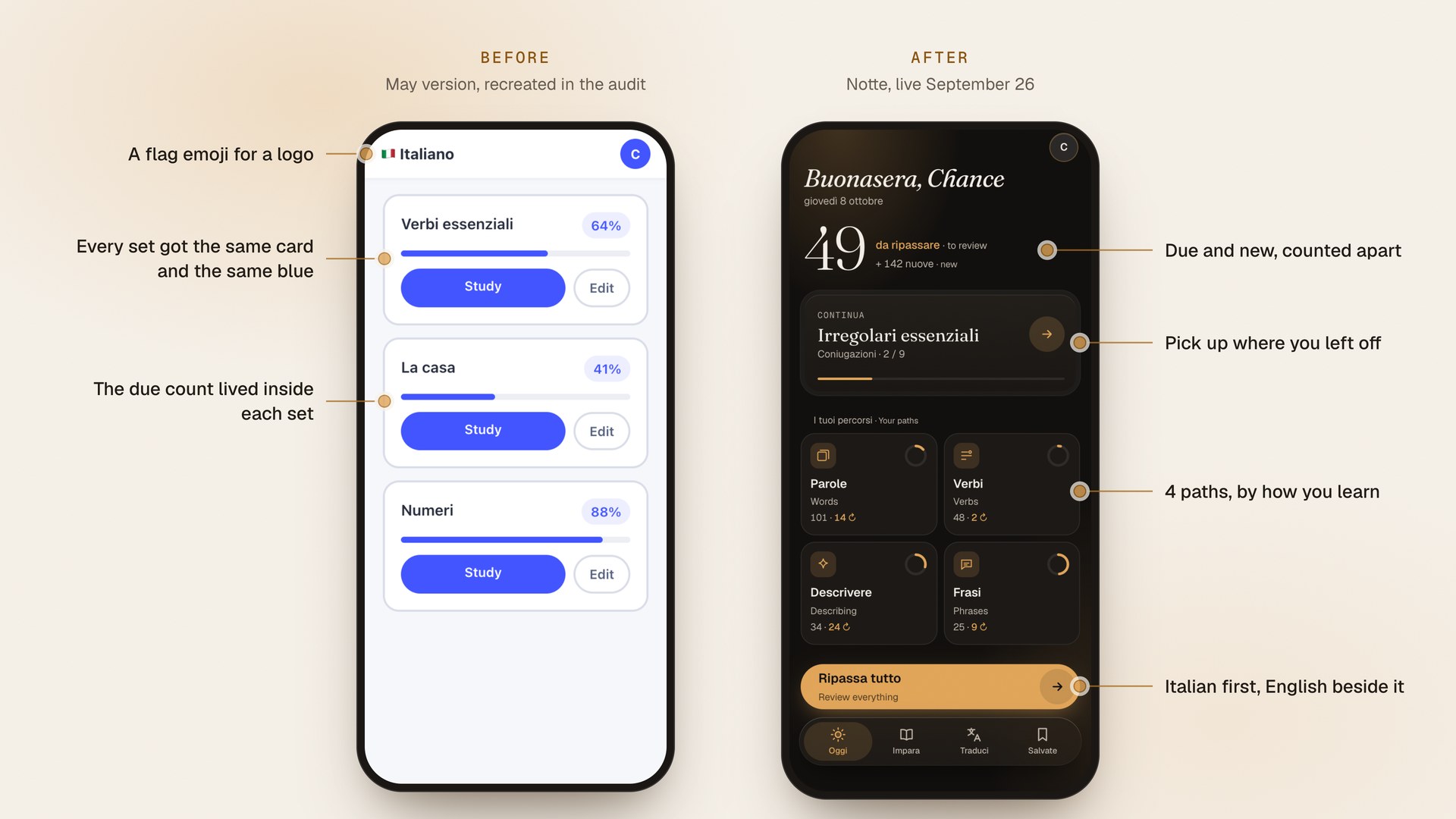
The September audit’s first finding was about how it looked: “It reads as a Quizlet clone.” One saturated blue, a border and a shadow on every card, and an even grid of identical sets on the home screen.
What the Audit Found
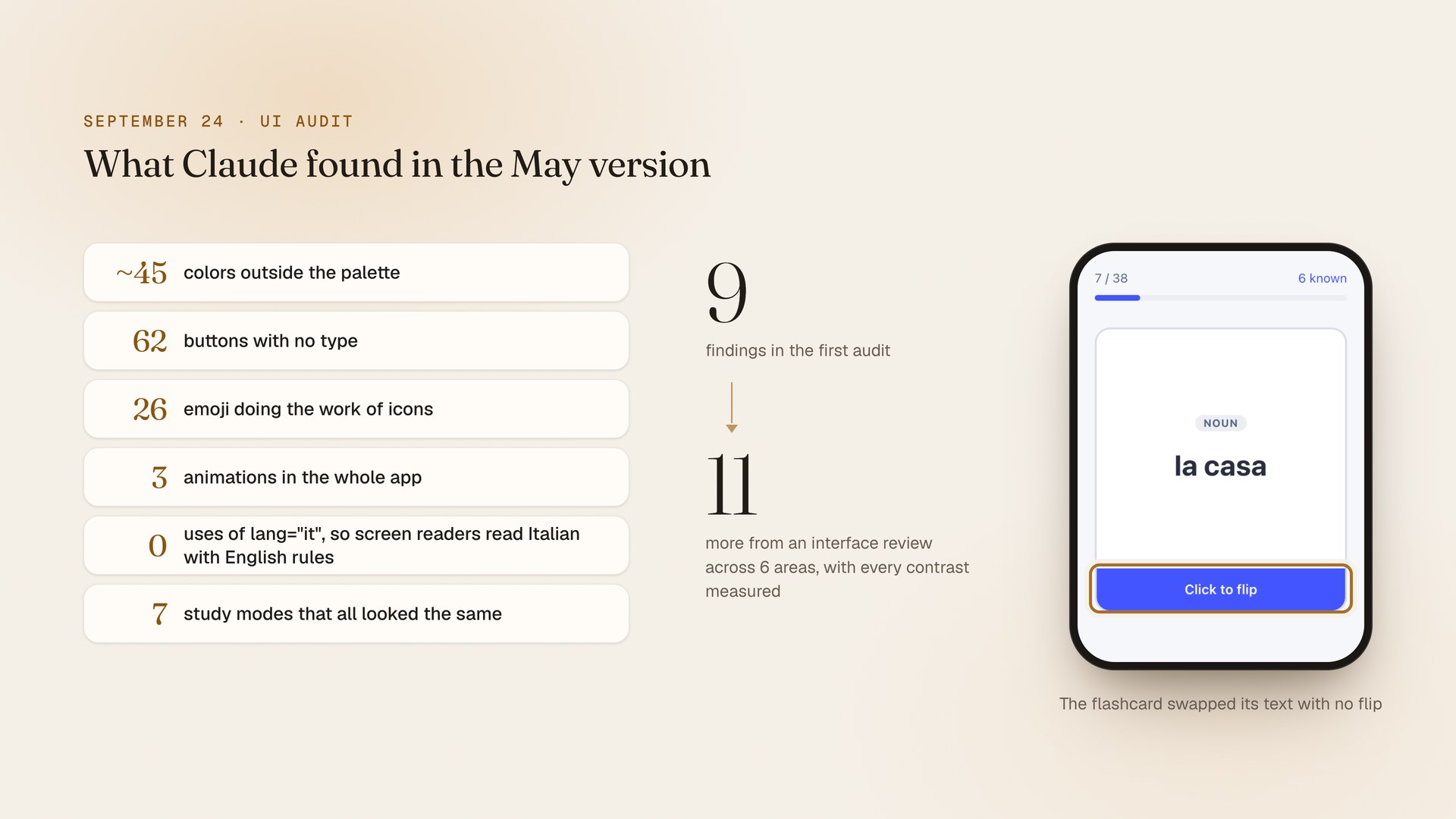
On September 24 I asked Claude to audit the app “to make it feel more premium.” The first pass found 9 problems before any new design existed. About 45 colors sat outside the palette. 62 buttons had no type, which broke a rule in the project’s own instructions. 26 emoji did the work of icons, and the flashcard swapped its text with no flip. The due count, the most useful number in a spaced-repetition app, only showed up inside each set.
A second review covered accessibility, layout, writing, typography, color and polish, and measured every contrast pair. It added 11 findings. The one with the widest reach: no Italian text was marked lang=”it”, so screen readers pronounced every Italian word with English rules.
15 Directions, 3 Starting Points
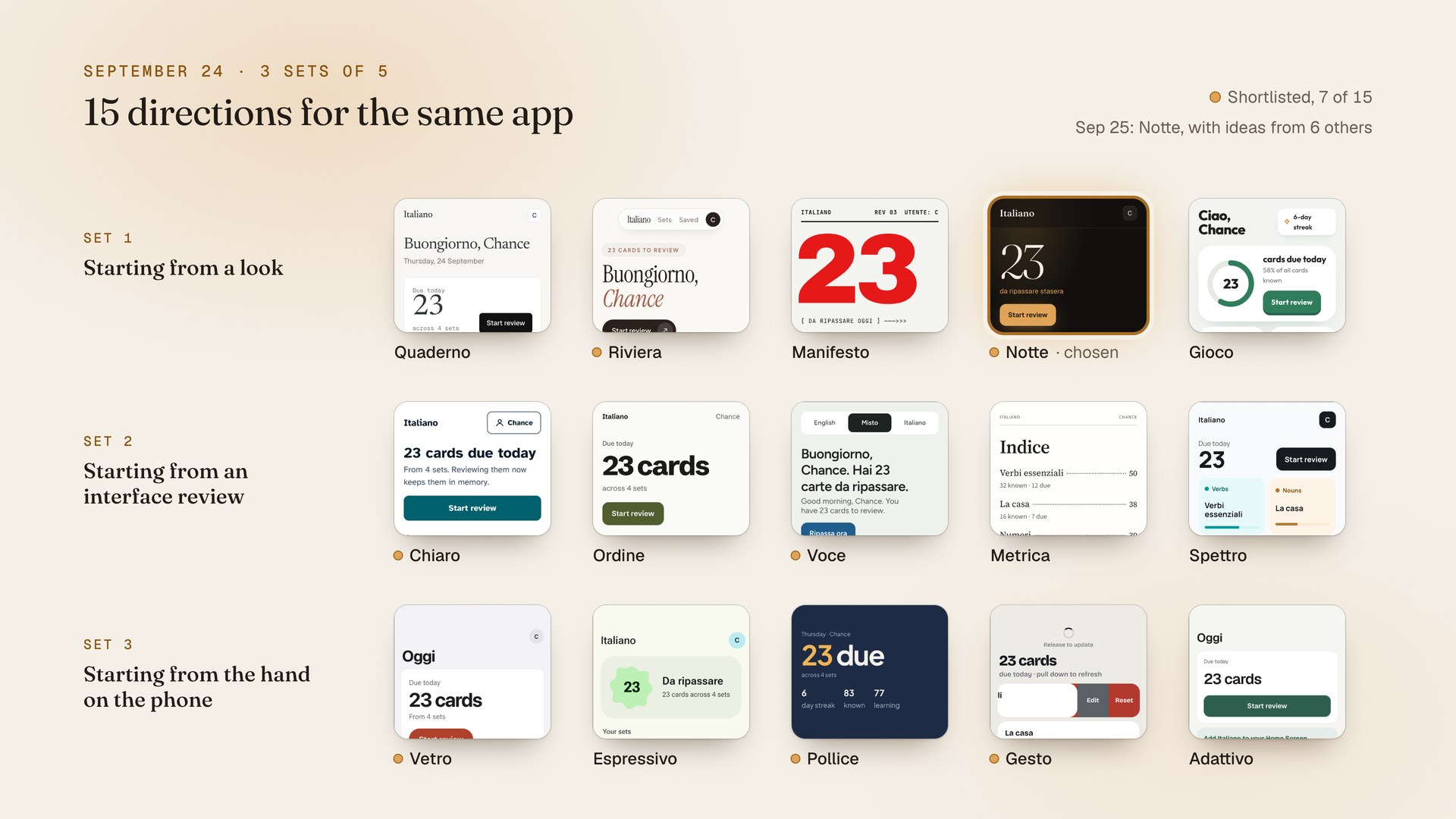
The same evening, Claude built 15 directions in 3 sets of 5. The first set started from a look. The second started from the interface review. The third started from how a hand holds a phone: iOS and Material patterns, thumb reach, and gestures.
The next morning I shortlisted 7, with a note on each. In that message I wrote, “we only use these on our phone, or at least 95% of the time.” So the plan went phone-first, with a desktop version you switch on in the profile.
Notte won, with Ambra as its only color. It also took ideas from 6 of the others: swiping from Gesto, bilingual labels from Voce, the glass tab bar and large titles from Vetro, and Pollice’s split, where the top of the screen is for reading.
Grouped by How You Learn
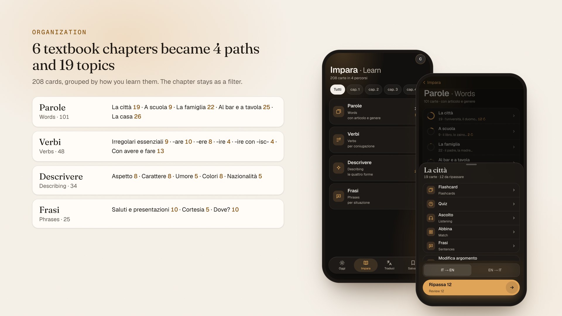
The first version had 6 sets, one per chapter, with nouns, verbs and adjectives mixed together. I asked to remove the chapters and “categorize everything a bit better for learning.”
The 208 cards now sit in 4 paths and 19 topics. Nouns are grouped by theme and always show their article and gender. Verbs are grouped by conjugation pattern, with idioms next to the verb they’re built on. Adjectives show all 4 forms, and phrases are grouped by situation. The chapter number stays as a filter and a small tag.
Moving cards between sets could have wiped our progress. The regroup script ran as a dry run by default, failed if any of the 208 cards didn’t match a topic, and kept every card’s id, so our review history came along.
Study Modes for One Hand
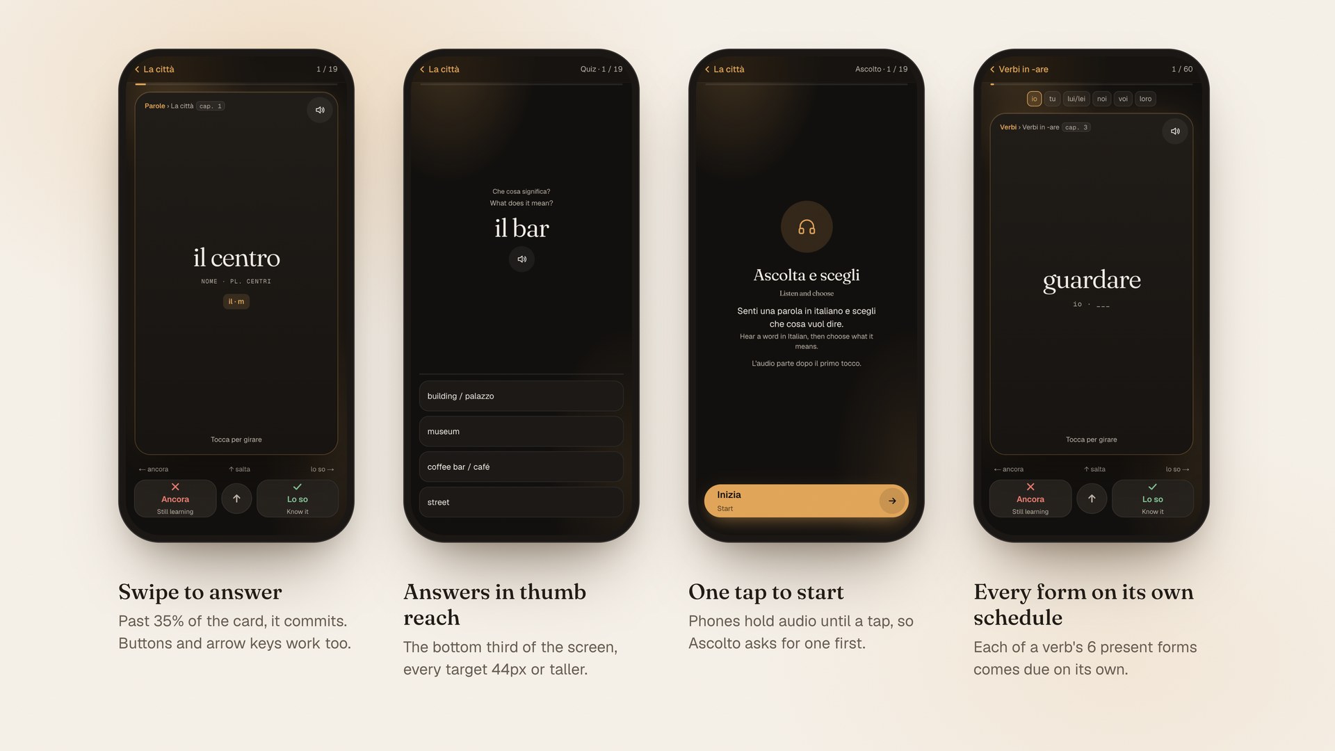
Each path lists the modes that fit it, in its own order. Verbi starts with conjugations, Frasi with listening. A mode that needs 4 cards stays visible when a topic has fewer, with the reason inline.
Flashcards are a swipe deck. Past 35% of the card’s width, the swipe commits, and buttons and arrow keys do the same thing. Answers sit in the bottom third of the screen, every target is 44px or taller, and every answer has an icon, a label and a color.
2 counting bugs got fixed along the way. Oggi counted every card we’d never studied as due, and the day rolled over on UTC, at 5pm our time. Now due and new are counted apart, the day turns over at our own midnight, and each verb form gets its own review schedule.
The Small Things
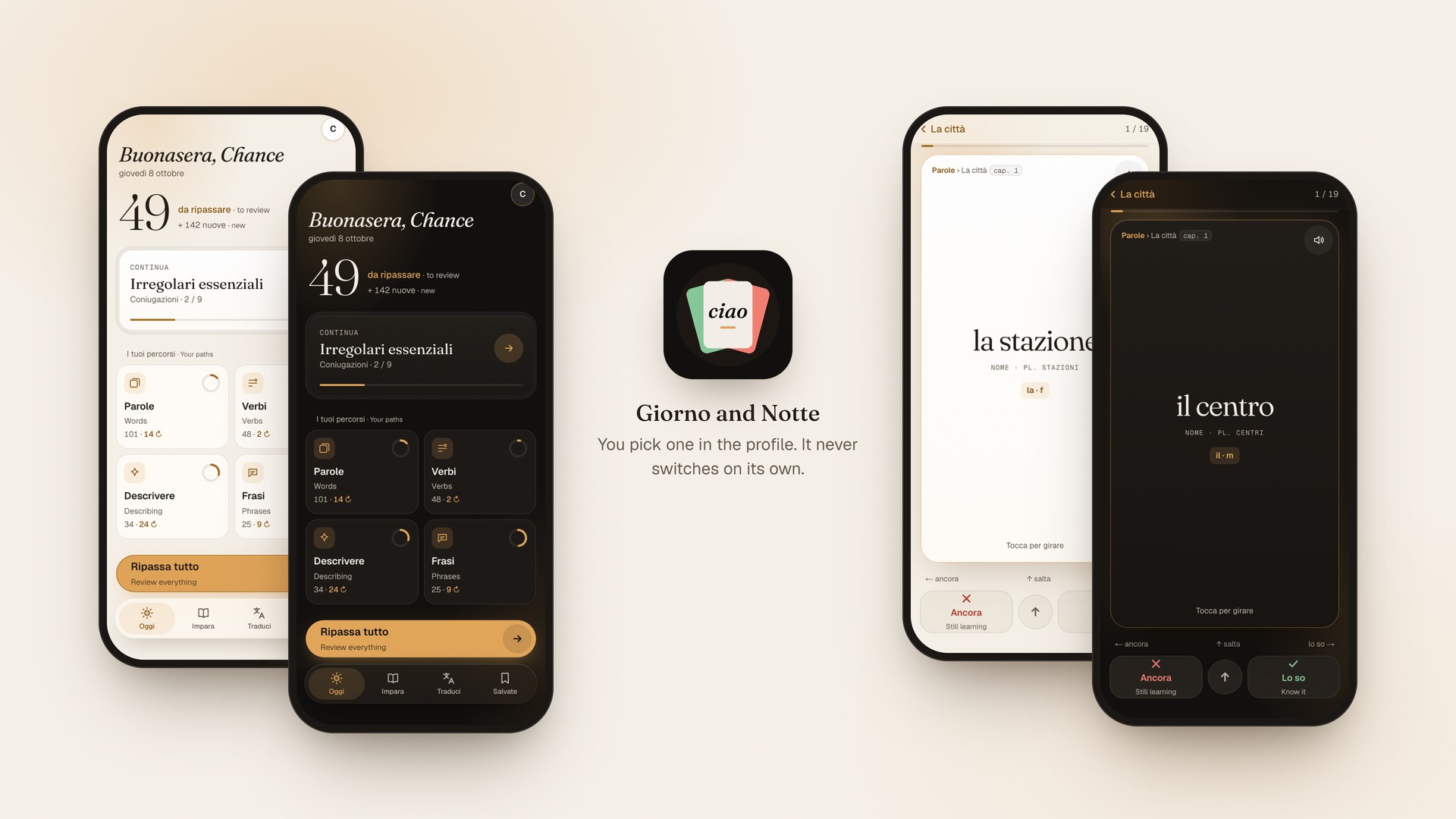
There are 2 modes, Giorno and Notte, and you pick one in the profile. It never switches on its own. Ambra on Giorno’s paper measures 1.94:1, too light to read, so Giorno uses a deeper Ambra for text at 5.51:1 and gives filled buttons a 1px edge.
Every Italian string is marked lang=”it”. A setting for how much Italian you want switches the labels between English, a mix, and all Italian. The default is the mix: Italian first, with smaller English beside it.
Motion uses 4 durations, from 150ms to 550ms. With reduced motion on, slides and flips become fades, and nothing loops except a soft glow while audio plays.
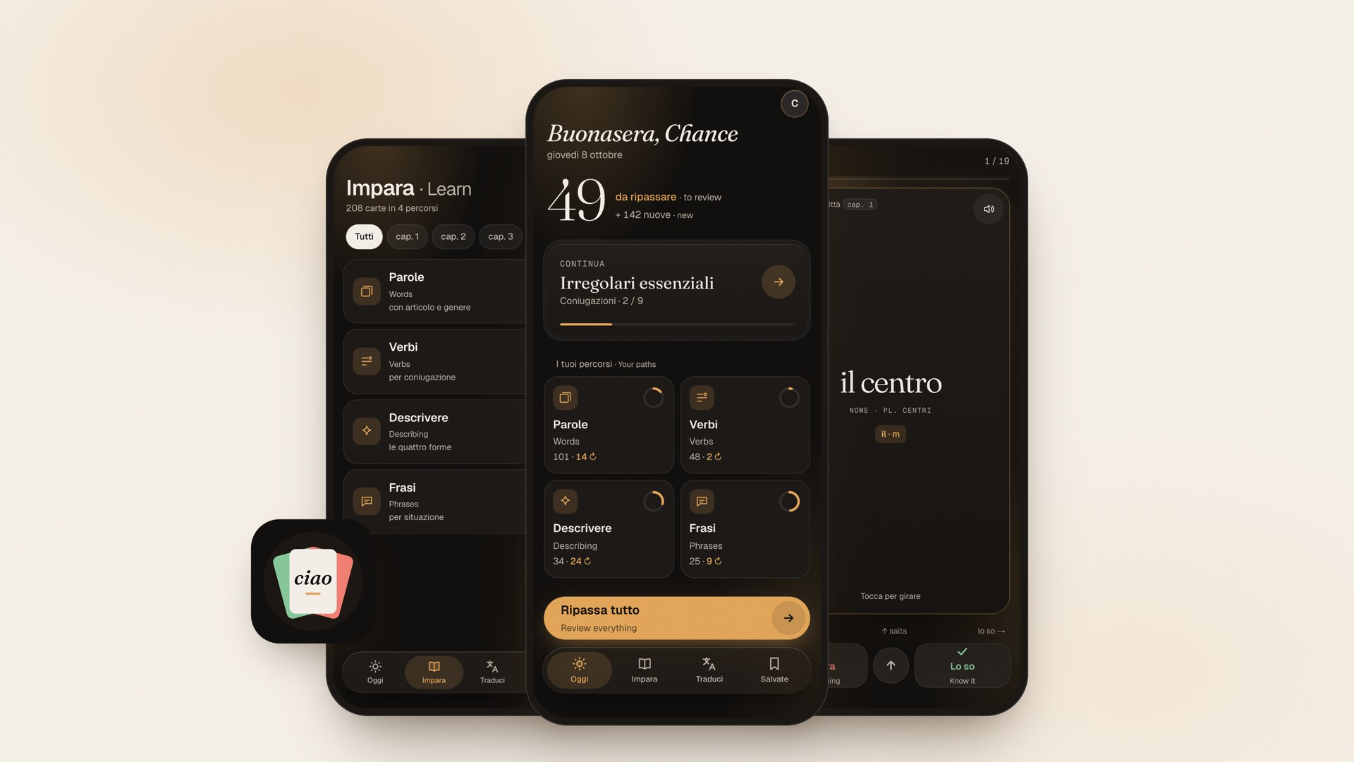
The icon is “Il mazzo,” a fanned deck of cards with “ciao” on top.
Additional Work
FitCoach
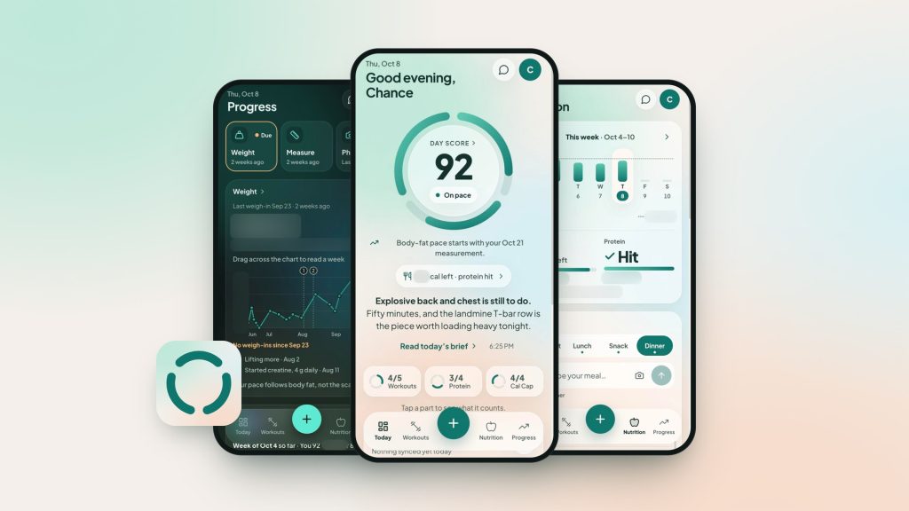
An AI fitness coach my wife and I use to stay consistent.
Months in Use
Days, Direction to Production
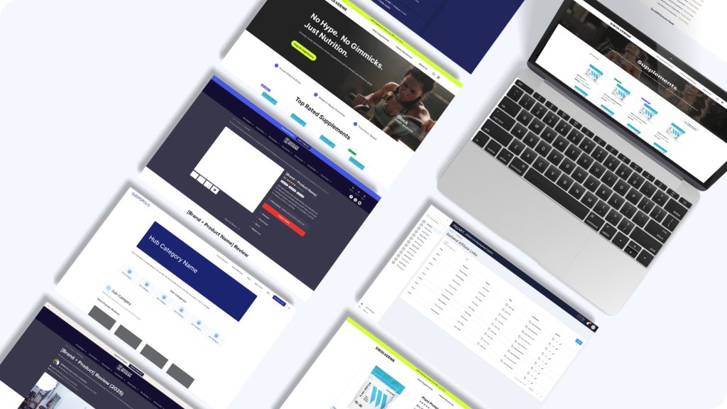
Pillar4 Media
The design function, the experimentation program, and the AI workflow across a multi-brand portfolio.
Design lead on the experimentation program
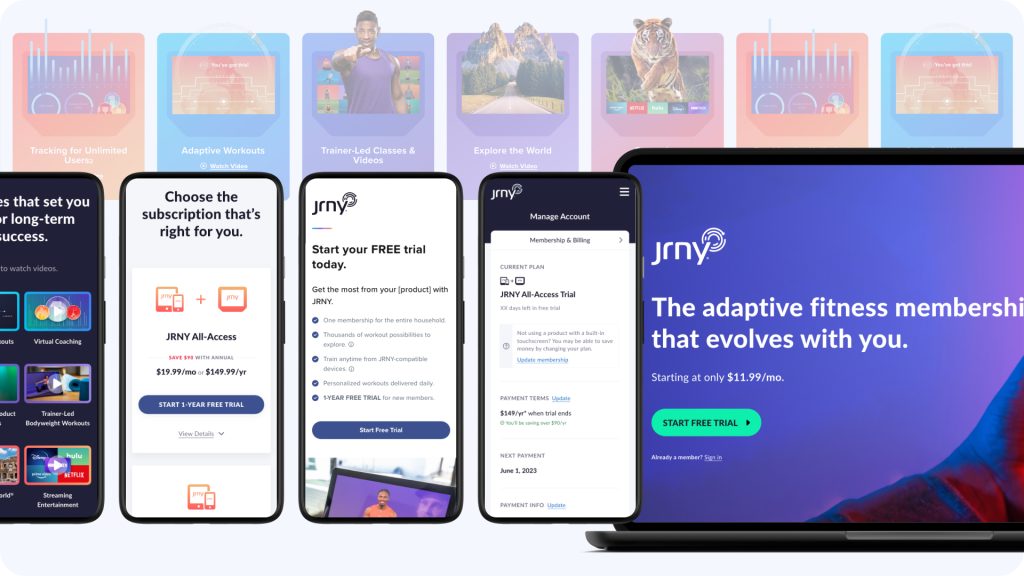
JRNY Connected Fitness Platform
The other half of the BowFlex story: the connected fitness platform’s web experience, from 0 to 1.
Platform Members
Paid Subscribers
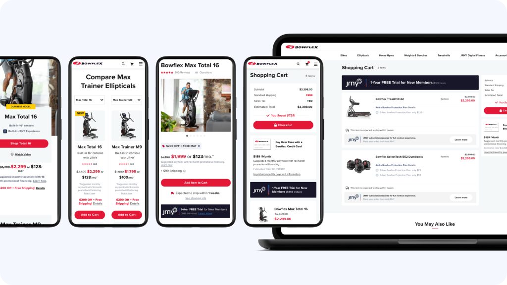
BowFlex Ecommerce
Established BowFlex’s first Web UX practice, then owned the ecommerce redesign end to end.
One Design Practice
Homepage > Post-Purchase