

FitCoach
Role
Product design and direction
Scope
Product strategy, UX and UI, design system, coach behavior, specs and QA
Tools
Claude, Claude Code, Anthropic API, Next.js, Supabase, Vercel
Timeline
June 2026 – present
Months in Use
Foods Logged
Directions Explored
Days, Direction to Production
The Problem
My wife and I train most weekdays, log what we eat, and wear watches that record every session. All of that data lived in different apps, and none of them could tell us why something was or wasn’t working. I wanted a coach I could ask about my workouts, my eating, even my running form, and get an answer based on what we’d done that week.
What We Had
- A Pixel Watch and an Apple Watch recording every session
- Meals logged most weekdays, mostly the same ones
- Check-ins every few weeks: weigh-ins, tape, photos
- Google Health on one phone, Apple Health and MyFitnessPal on the other
What Didn't Exist
- One place that saw food, training, and progress together
- A coach that could explain why, using our own numbers
- A shared view that kept each person's numbers private
What I Did
I designed and directed it. Claude Code wrote nearly all of the code. I set the product direction, designed every screen, wrote the specs, and reviewed every change before it shipped. That’s 289 commits on main across 32 days of work between June and October.
The coach is the reason the app exists. Every other screen is there to give it better data or to act on what it says.
Version One in Five Days
The first commit was June 7. By June 11 we had food logging, a coach chat, a daily brief, and workouts syncing from both watches: my Pixel Watch through Google Health, my wife’s Apple Watch through Health Auto Export.
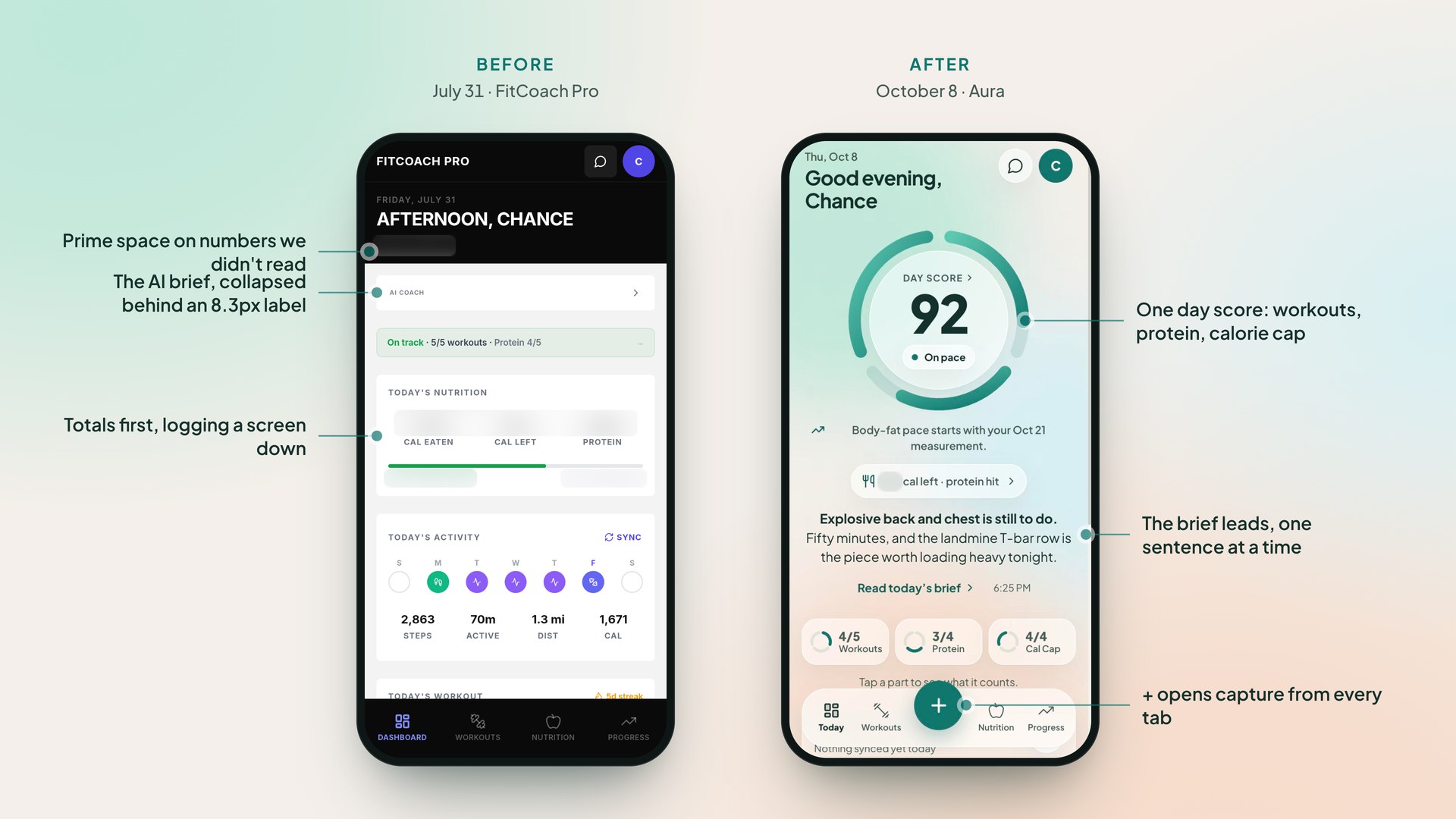
We used it all summer, and by August I could say what was wrong with it. The home screen almost seemed useless. We’d open the app and go straight to Nutrition or Progress to log something.
Eight Passes on Version One
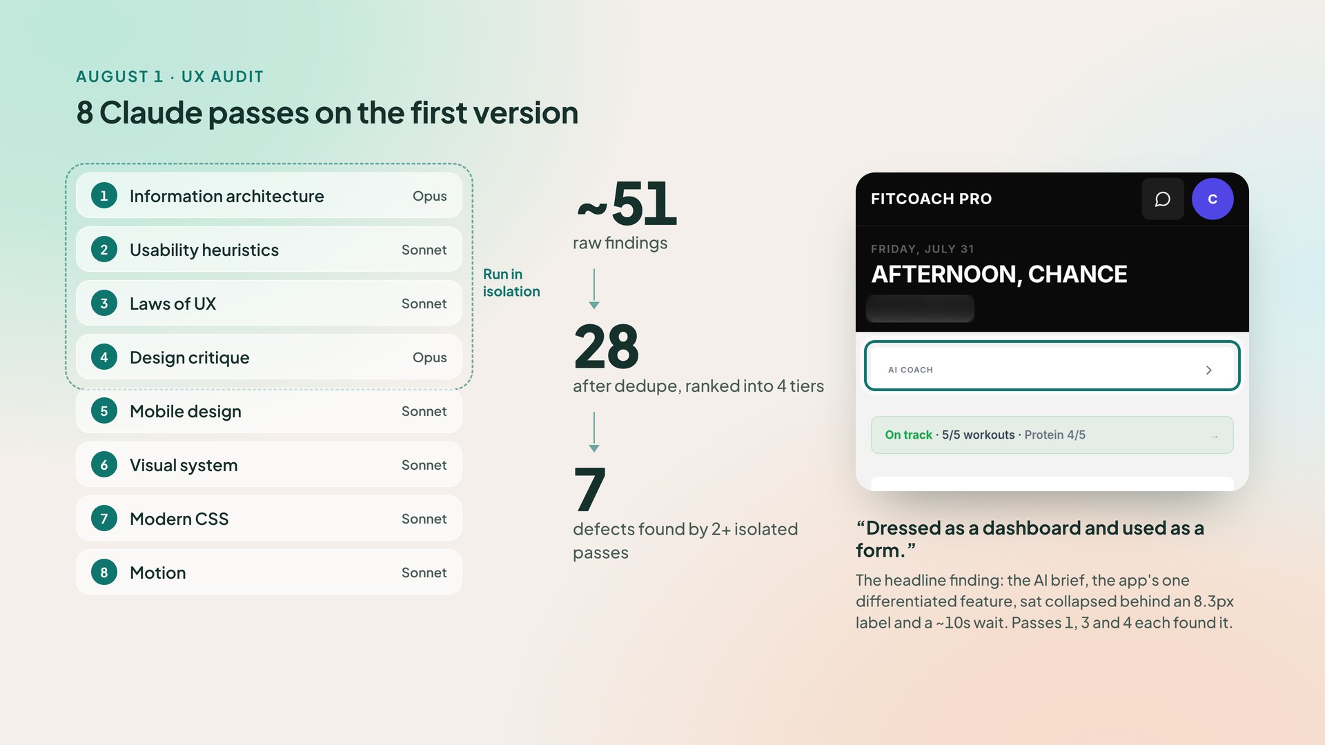
Before redesigning anything, I ran a UX audit with Claude. It was 8 passes: information architecture, heuristics, Laws of UX, critique, mobile, visual, CSS, and motion. The first 4 ran in isolation, so when they agreed, it counted.
About 51 findings came down to 28. The verdict was blunt: the app was “dressed as a dashboard and used as a form.” The AI brief, the reason we built the app, sat collapsed behind an 8.3px label and a 10-second wait. Three isolated passes found that on their own.
The audit also logged its own mistakes. One early claim would have deleted the daily brief, and pass 1 caught it. Since then, AI findings get checked against the code and against how we use the app before anything changes.
Eight Directions, Then Aura
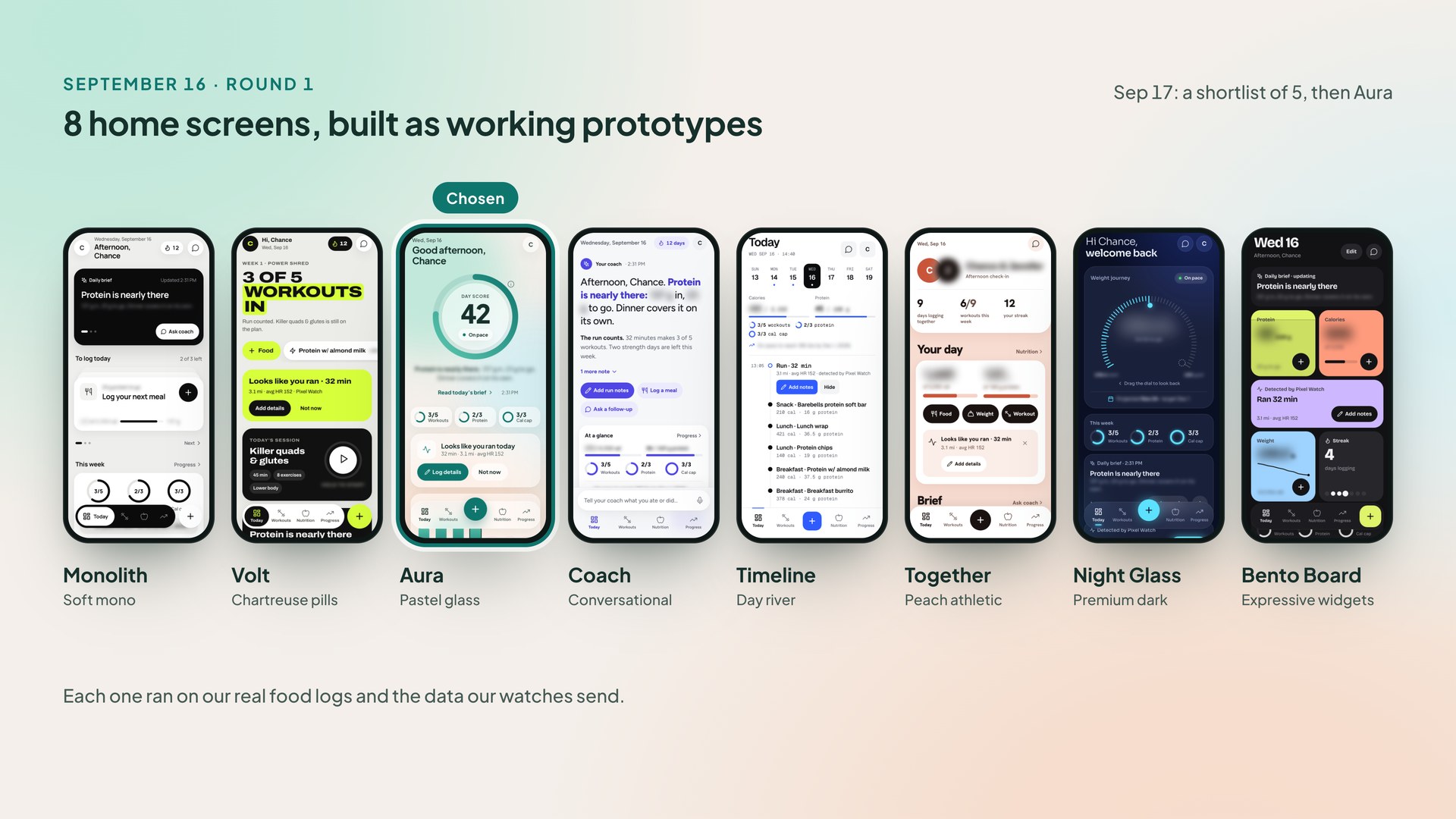
On September 16 I had Claude build 8 home screen directions as working prototypes. Each one ran on our real food logs and the data our watches send.
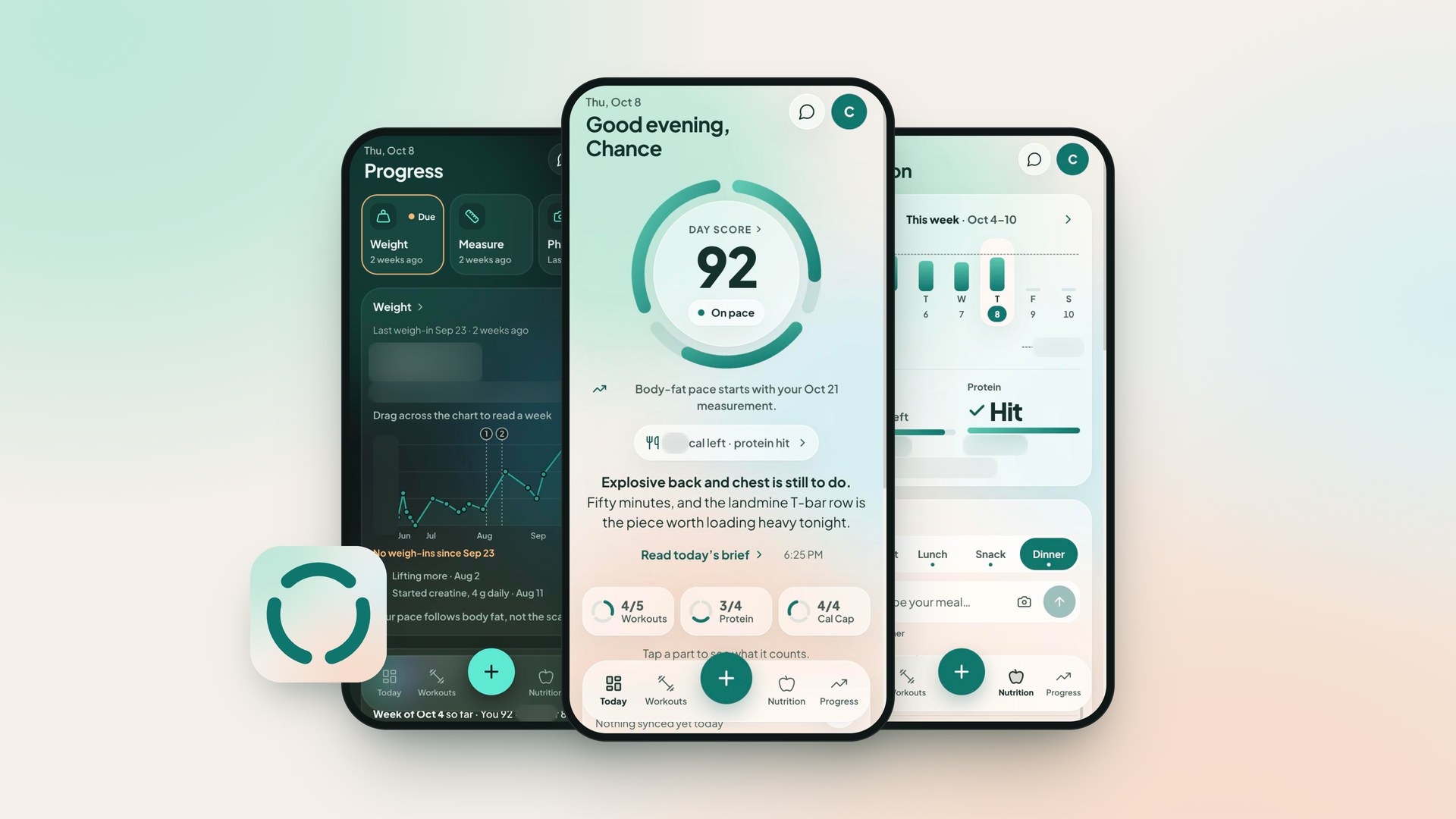
The next day the shortlist was 5, including 2 hybrids, and Aura won. It turns the week so far into one number: a day score split into workouts, protein, and the calorie cap. Its card stack was short enough that Bento’s drag-to-rearrange had nothing left to rearrange, so that idea went too.
Versions 8 through 14 rebuilt each tab against real data. Aura shipped September 21, 4 days after we picked it.
A Coach That Reads Everything
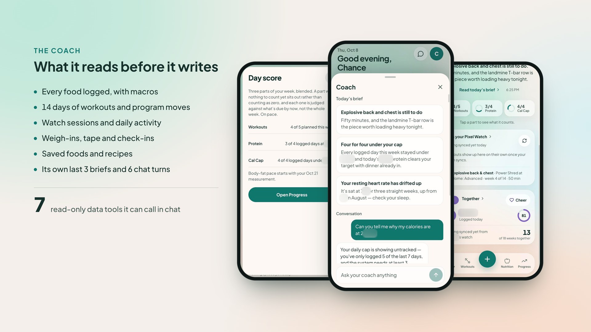
Every coaching call gets a snapshot of our data: food with macros, 14 days of workouts and program moves, watch data, weigh-ins, tape, check-ins, and our saved foods. In chat it can call 7 read-only tools to look further back. The daily brief skips the tools so it stays fast.
A test fails whenever a new database column is neither shown to the coach nor excluded with a written reason. The coach can’t lose track of something we started logging.
I learned how much context matters the hard way. Early on, the coach kept suggesting lower calorie targets, because it judged what I ate against my target and never saw what I burn. Giving it the full energy budget fixed that.
The brief is 3 items, one sentence each, 20 words or less. It used to bring up measurements in 6 of 7 briefs, so now a check-in comes up once when it’s due, then weekly.
Built Around How We Log
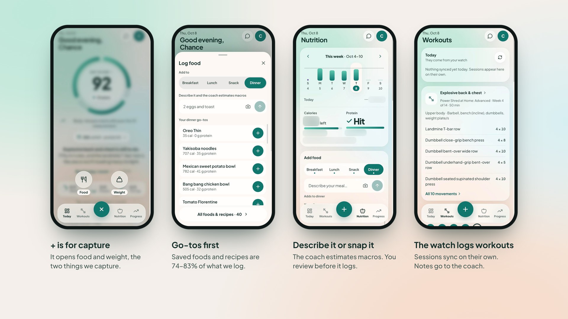
Before redesigning Nutrition, I looked at our real logs. Saved foods and recipes are 74–83% of everything we log. My wife logs Tuesday through Friday ahead of time, every Monday. I log in batches and fix servings afterward.
So Log food opens on your go-tos for that meal, days logged ahead don’t get graded early, and servings are absolute. The old multiplier compounded every time you edited it, so 1.5× twice became 2.25×.
For anything new, you describe it or take a photo, and the coach estimates the macros. You review the estimate before it logs, and photos aren’t stored.
Workouts only come from the watches, so I cut manual workout logging. That commit deleted 1,902 lines. The Workouts tab shows what synced and takes notes for the coach.
Shared Effort, Private Numbers
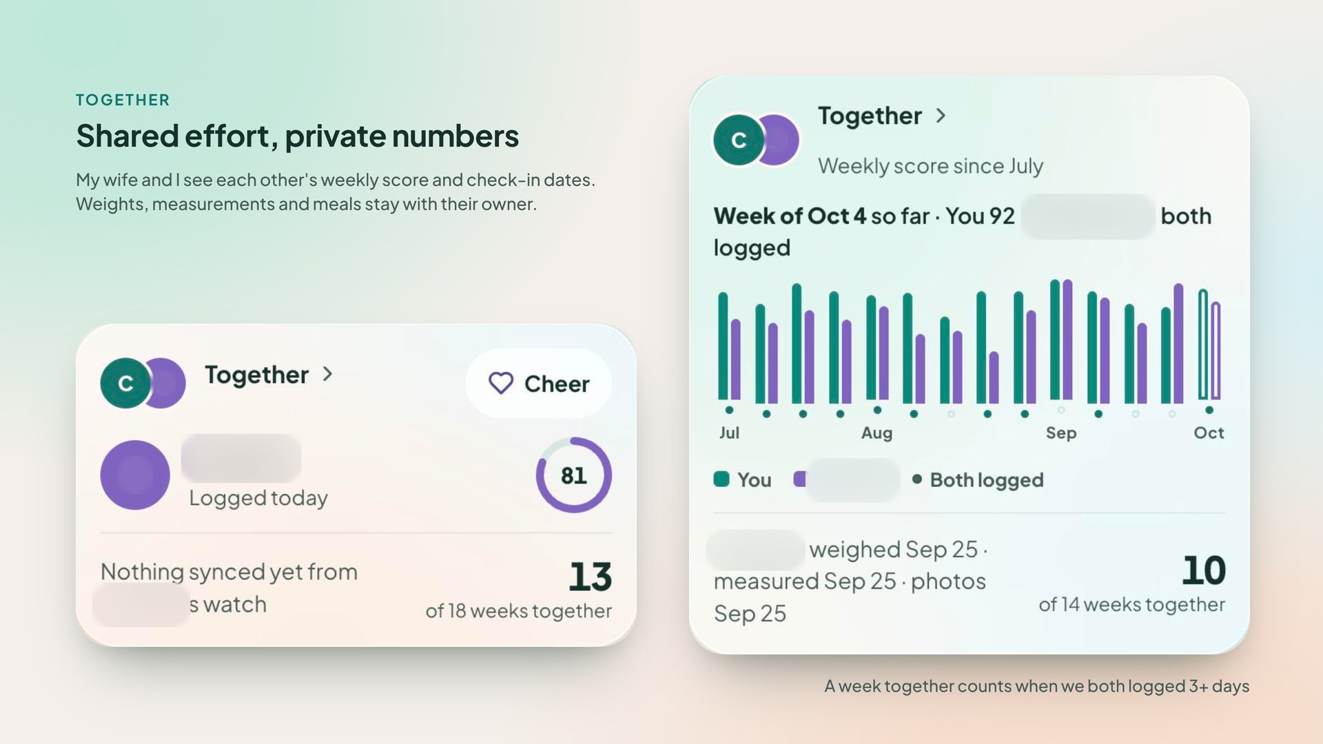
We each have our own account and our own data. The Together card shows the other person’s weekly score and check-in dates, and that’s all. A test checks exactly which fields the partner view can read, so it stays that way.
We both log food Monday through Friday, so a daily streak would break every weekend. The shared count is weeks we both logged food on 3 or more days.
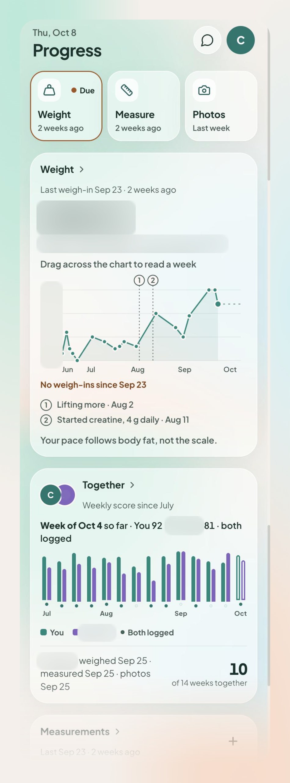
Progress puts the scale and the tape measure side by side in neutral colors. When you’re losing fat and building muscle at the same time, they can move in opposite directions, and a red number on a good week is wrong. Pace, the estimate of when you’ll reach a goal, won’t project from a weigh-in older than 21 days. With that guard off, it once gave a goal date based on a reading 8 weeks old.
The Small Things
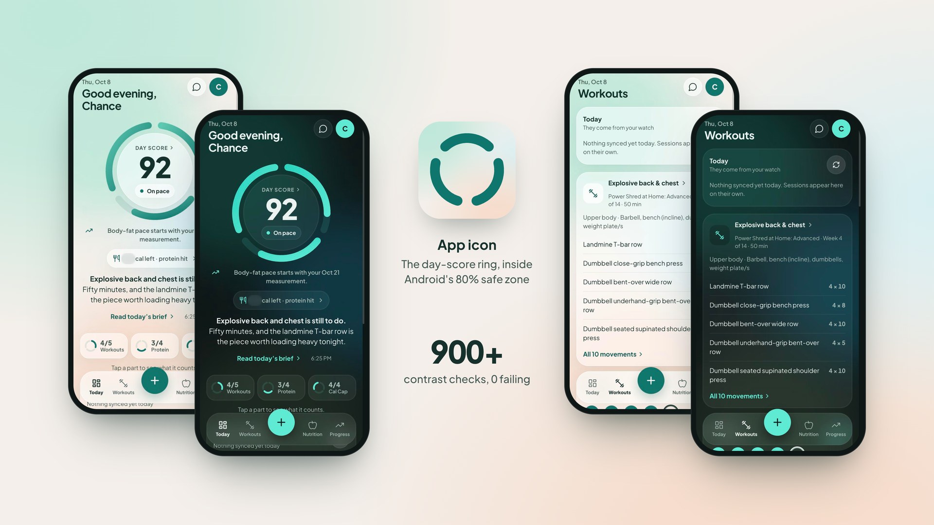
My contrast checker once reported 0 failures while comparing nothing, because of a key mismatch. Now every checker prints how many comparisons it ran and gets run against a broken copy that has to fail. The app’s checker runs 900+ comparisons with 0 failing, and a separate test covers dark mode.
Every sheet in the app closed on a keyboard press for 7 weeks. The backdrop check read the click position, and a keyboard click reports (0,0), so every Enter or Space landed outside the sheet.
The icon is Aura’s day-score ring, picked from 5 concepts. The gaps are 34° so the round caps don’t touch, the ring sits inside Android’s 80% safe zone, and it’s turned 60° so the empty ring doesn’t read as a face.
Additional Work
Italiano
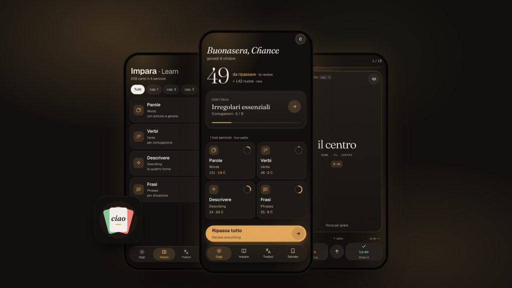
A study app my wife and I use to learn Italian from our textbook. I designed and directed it, and Claude Code wrote the code.
Directions Explored
Days, Audit to Production
Pillar4 Media
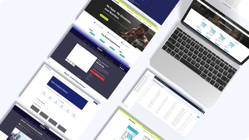
The design function, the experimentation program, and the AI workflow across a multi-brand portfolio.
Design lead on the experimentation program
JRNY Connected Fitness Platform
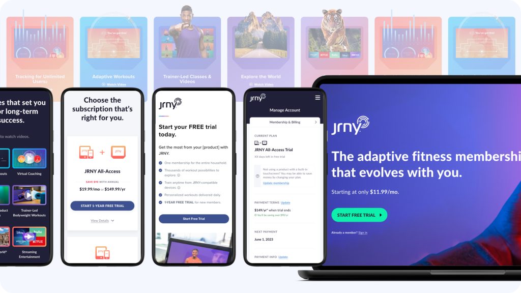
The other half of the BowFlex story: the connected fitness platform’s web experience, from 0 to 1.
Platform Members
Paid Subscribers
BowFlex Ecommerce
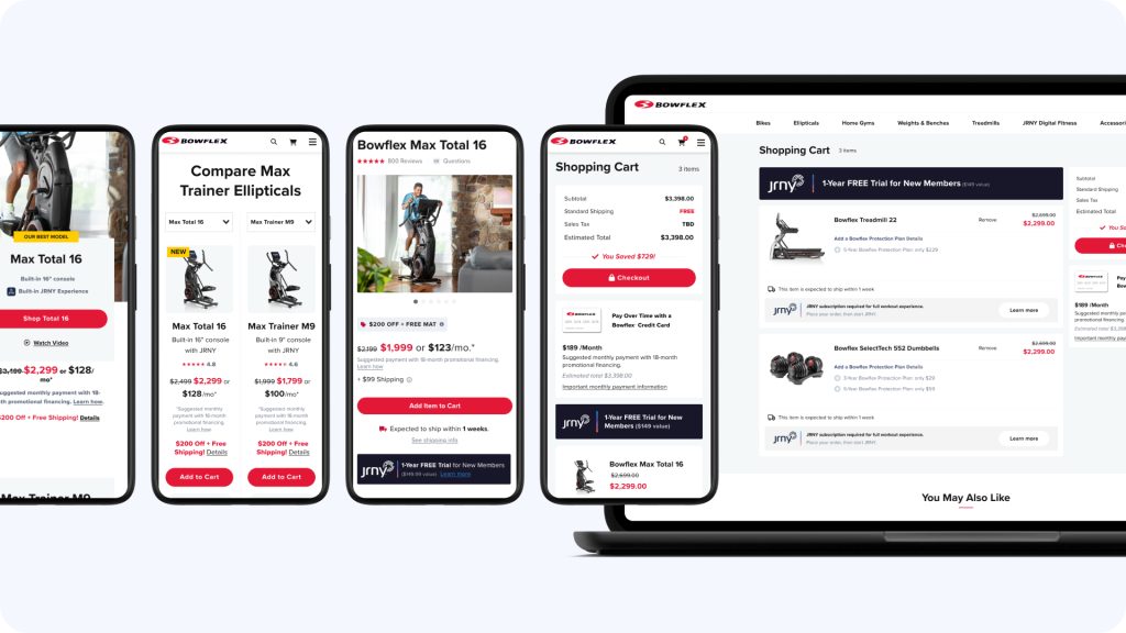
Established BowFlex’s first Web UX practice, then owned the ecommerce redesign end to end.
One Design Practice
Homepage > Post-Purchase